Design comparison
Solution retrospective
Finally finished!
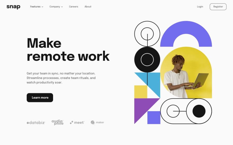
Spent the last few weeks on this project, not my proudest work but I kid you not...my house burned down midway through this project so I'm proud of myself for pushing through it. As always, my thoughts and design approach are in the GitHub readme file. Usually, I like to add my own flair to the site and I still did that. If only a tiny bit, I made a portion of the header highlighted in purple, and I changed some of the buttons so they would use purple as a secondary color.
Some problems I ran into:
-
I spent a large portion of my time working on the header, as this was my first time familiarizing with dropdown boxes. I think I did a decent job there for my first time!
-
I just couldn't get the images to fit properly, even now the images arent exactly where I want them to be, especially the hero image. However I need to finish the project eventually, so where it is right now will do.
Let me know what you guys think.
Community feedback
Please log in to post a comment
Log in with GitHubJoin our Discord community
Join thousands of Frontend Mentor community members taking the challenges, sharing resources, helping each other, and chatting about all things front-end!
Join our Discord
