Design comparison
SolutionDesign
Solution retrospective
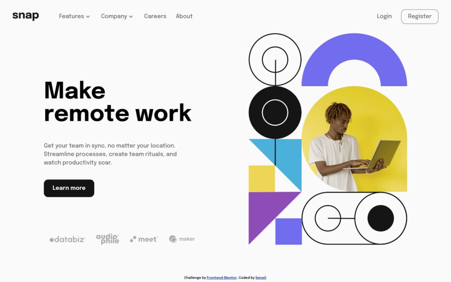
I've made the dropdown nav behave differently on desktop and mobile. On desktop, only one dropdown can be open at a time while on mobile it can be open simultaneously. But I think my JS can still be improved. Check it out and feel free to comment any feedbacks, Thanks.
Please log in to post a comment
Log in with GitHubCommunity feedback
No feedback yet. Be the first to give feedback on lieneil's solution.
Join our Discord community
Join thousands of Frontend Mentor community members taking the challenges, sharing resources, helping each other, and chatting about all things front-end!
Join our Discord
