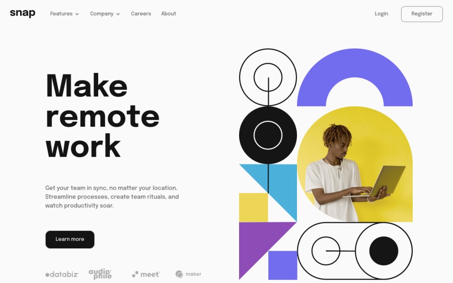
Snap Dropdown, native javascript, lots of sweat so please feedback ;)
Design comparison
Solution retrospective
So. This took me crazy long and not because of any css or html challenges but because i'm really sh*t at javascript so it seems. I know im not good at js, but thought this would be easier because it's 'only' a junior challenge.
Probably i could have gone an easier route by just adding/toggle a active class on a parent list item and style everything based on that class, but because tailwind is my go to at this moment i really wantend to switch classes based on a event listener.
So i ended up doing this (after trying lots of things).
const toggles = document.querySelectorAll('.js-toggle');
// Toggle Dropdowns
toggles.forEach(toggle => {
toggle.addEventListener('click', function (e) {
// If the clicked item already is open then close it and rotate svg back
if (toggle.querySelector('ul.menu').classList.contains('grid')) {
toggle.querySelector('ul.menu').classList.remove('grid');
toggle.querySelector('ul.menu').classList.add('hidden')
toggle.querySelector('svg').classList.remove('rotate-180')
} else {
// Close all submenus forst before opening the cliked one.
toggles.forEach(element => {
element.querySelector('ul.menu').classList.remove('grid');
element.querySelector('ul.menu').classList.add('hidden');
element.querySelector('svg').classList.remove('rotate-180');
});
// Open submenu
toggle.querySelector('ul.menu').classList.remove('hidden');
toggle.querySelector('ul.menu').classList.add('grid');
toggle.querySelector('svg').classList.add('rotate-180')
}
});
});
I hope you can give me some feedback so i can improve on this area.
Something else i'm always struggle with are mobile navigations. In the old day's i often made 2 navigations. One for dekstop and one for mobile. Then i would just show and hide these based on media queries. But these day's i try to convert one nav to desktop and mobile. Is this the way to go, or are you guys (and girls) still doing two navs?
Lastly i didn't make it pixel perfect because my focus was js. Will make thing pixel perfect when i upgrade to pro ;)
Community feedback
- @imadvvPosted over 2 years ago
Hey CodedForFree!! actually you don't need all that Complexity for Menus like this , you can a lot with just css. and you don't have to duplicate menu.
for example let's imagine that we have menu like so
<nav role="navigation"> <ul> <li><a href="#">Home</a></li> <li><a href="#">Features</a></li> <li><a href="#">About</a></li> </ul> </nav>
Now, say we want a sub-menu dropdown on the second navigation item. and for interactivity reason, we need to change
li
to[button](https://developer.mozilla.org/en-US/docs/Web/HTML/Element/button)
element because is interactive by default which will make our life mush easy for implementing styling and accessibility , so we can include a list of links within that button:<button type="button"><a href="#">Features</a> <ul class="dropdown"> <li><a href="#">feature-1</a></li> <li><a href="#">feature-2</a></li> <li><a href="#">feature-3</a></li> </ul> </button>
now when we have our
button
, In order to have the content hidden and displayed when we want it to be visible, we’ll need to apply some CSS. and we will take advantage of The:focus-within
pseudo selector.button { position: relative; cursor: pointer; } button ul { display: flex; flex-direction: column; align-items: center; text-align: center; position: absolute; width: 9rem; left: 0; z-index: 3; list-style: none; padding: 1rem .25rem; margin-top: 1rem; border-radius: 0.5rem; visibility: hidden; opacity: 0; transition: all 200ms ease-in-out; } button:hover ul , button:focus-within ul { visibility: visible; opacity: 1; } /* Now, the submenu dropdown is hidden, but will be exposed and become visible when we hover over its */
and for Mobile Navigation, you don't have to duplicate the navigation. My process on implement it like so ,
I stared with nav like so.
index.html
<nav class="primary-nav"> <button class="mobile-toggle" type="button" aria-expanded="false" aria-label="Menu" ></button> <ul class="nav-links" data-nav-toggled="false"> <li><a class="nav-link" href="#">About</a></li> <li><a class="nav-link" href="#">Services</a></li> <li><a class="nav-link" href="#">Projects</a></li> <li><a class="nav-link" href="#">Contact</a></li> </ul> </nav> /* Notice That am using **data-attribute** to keep track of menu */
style.css
/* Base style FOR Navigation */ .navigation { display: flex; align-items: center; justify-content: space-between; padding: 2rem; } .nav-links { list-style: none; display: flex; align-items: center; flex-direction: row; gap: 2rem; } .mobile-toggle { display: none; } /* Mobile Nav */ @media (max-width:50rem) { .mobile-toggle { display: block; height: 1.75rem; width: 1.75rem; border: 0; outline: 0; background-color: transparent; background-image: url(/assets/images/icon-hamburger.svg); background-position: center; background-size: cover; cursor: pointer; } .mobile-toggle:focus { outline: auto; outline-offset: 3px; } .mobile-toggle[aria-expanded="true"] { opacity: 0.6; /* style the button when menu opened usually by changing background image to `close-btn` icon*/ } .nav-links { flex-direction: column; /* Your styles for the mobile nav */ position: fixed; z-index: 3; opacity: 0; visibility: hidden; transform: scale(0) rotateY(90deg); transition: all 400ms ease-in-out; } .nav-links[data-nav-toggled="true"] { opacity: 1; visibility: visible; transform: scale(1) rotateY(0deg); /* when menu opened */ } }
and that structure make our JavaScript simple like so .
const mobileToggle = document.querySelector(".mobile-toggle") const navLinks = document.querySelector(".nav-links") mobileToggle.addEventListener("click", () => { const isToggled = navLinks.getAttribute("data-nav-toggled") if (isToggled === "false") { navLinks.setAttribute("data-nav-toggled", "true") mobileToggle.setAttribute("aria-expanded", "true") } else { navLinks.setAttribute("data-nav-toggled", "false") mobileToggle.setAttribute("aria-expanded", "false") } })
and here you have it , you can check out this reference
solved-with-css-dropdown-menus,
over all, I Hope This Help!!, Have a Great Day/Night
Marked as helpful1
Please log in to post a comment
Log in with GitHubJoin our Discord community
Join thousands of Frontend Mentor community members taking the challenges, sharing resources, helping each other, and chatting about all things front-end!
Join our Discord