

Design comparison

Solution retrospective
I like that I managed to make the transition between the two windows smooth, but I don't like that it is not as smooth as I would have liked it to be. Doing things with 'display: none' is a bit finicky.
This is already my current limit. I am happy with what I accomplished.
The different thing that I would do is probably making use of classes to change styles through JavaScript, instead of doing it directly; if it is the correct way, but I will research this next...
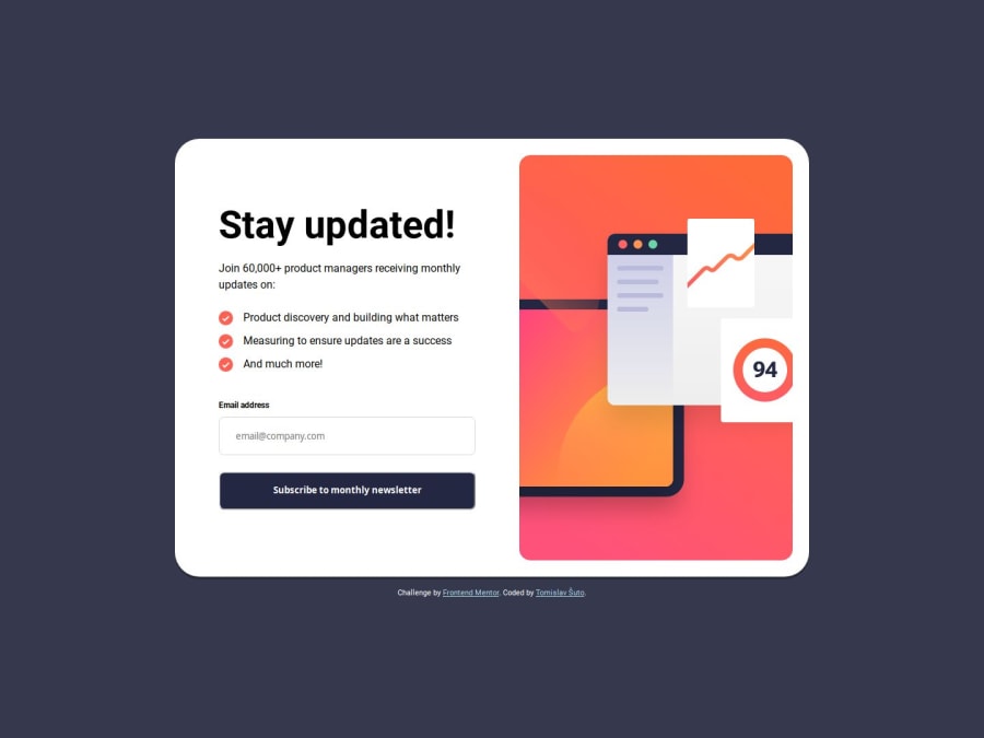
What challenges did you encounter, and how did you overcome them?That damn image just doesn't want to behave how I want it to behave. That is, until I put the image inside a div container. The problem might be that the image behaves strangely with flexbox when I want it to scale down in a certain way. Anyway, putting the image in a container makes it possible to use 'max-inline-size' as well as other properties. The container basically contains the image and does not allow it overflow. I used these settings on the image:
#img-main {
    display: block;
    height: 100%;
    max-inline-size: 100%;
    object-fit: cover;
    object-position: right;
    border-radius: 1rem;
}
Though I am aware that there probably exists a better solution, this is what helped me at the moment.

Join our Discord community
Join thousands of Frontend Mentor community members taking the challenges, sharing resources, helping each other, and chatting about all things front-end!
Join our Discord