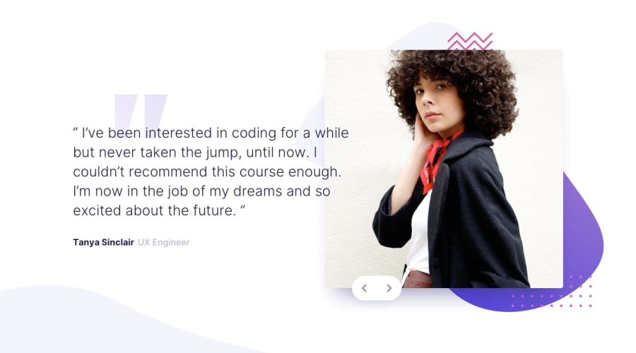
Design comparison
Solution retrospective
This was a fun project to practice animations. Any feedback is welcome :)
Community feedback
- @MarlonPassos-gitPosted about 3 years ago
Very cool your solution, practically a pixel perfect.
particularly the only thing I could suggest to you is to add a stronger style to the clickable button, so it's easier for the user to know that there are more images, maybe adding a
cursor: not-allowedto the disabled button would be nice. Another thing I see on sites with carousel is the possibility of changing the image using the keyboard arrows, maybe you can implement that too 😄1@ErayBarslanPosted about 3 years ago@MarlonPassos-git Thank you for the review :)
I thought of making another button icon that's darker but went with what's provided by starter files in the end. Will definitely do that for larger projects. And adding arrow keys was in my plan forgot to implement, thanks for reminding.
1
Please log in to post a comment
Log in with GitHubJoin our Discord community
Join thousands of Frontend Mentor community members taking the challenges, sharing resources, helping each other, and chatting about all things front-end!
Join our Discord
