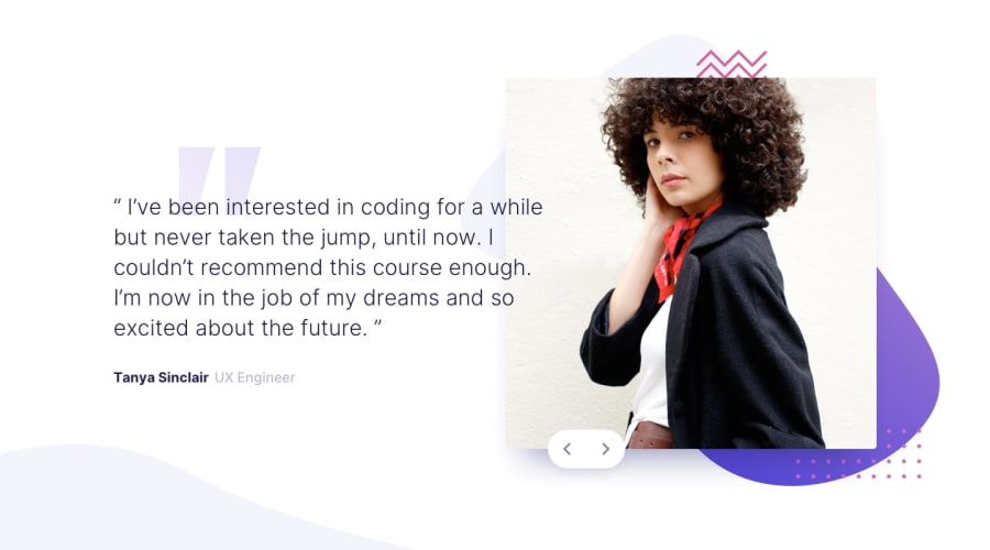
Design comparison
Solution retrospective
Hi guys,
I must say that challenge was a hard one. Was it really for newbie? :o Anyway, I had difficulties with .pattern-img. Namely, it is bigger than .carousel and .slider inner. On mobile devices less than 375px the whole content is left aligned. It is not what I want. Do you have any hints how to fix it? Thanks a lot
Community feedback
- @ApplePieGiraffePosted almost 4 years ago
Hey, Marta! 👋
Nice to see you complete another challenge! Nice job on this one! 👏
I suggest,
- Adding a hover state to the slider buttons.
- Making sure the body adapts to the height of the viewport so that the bottom-left background always stays at the bottom of the screen (even when the height of the screen increases).
- Adding a
max-widthto the main wrapper or container to prevent the paragraph from getting too stretched on extra-large screens. 😉
Keep coding (and happy coding, too)! 😁
1 - @axevldkPosted almost 4 years ago
Hi, Marta ~
I have studied your case. And about .patter-img, you used image tag for it, but it's not suitable in this case. In my opinion, there could be 2 ways to implement this.
One is to use background-image property. You can set this to background image of .slider-img. And the other method is to use pseudo element and also set this image to background of ::before or ::after one. Currently I haven't done this challenge yet, but will do soon and share my link here ~
Hope my words would be helpful even a bit. Happy coding ~
1
Please log in to post a comment
Log in with GitHubJoin our Discord community
Join thousands of Frontend Mentor community members taking the challenges, sharing resources, helping each other, and chatting about all things front-end!
Join our Discord
