Design comparison
Community feedback
- @MarlonPassos-gitPosted about 3 years ago
Hi Al-Baraa, some suggestions for you to improve your project
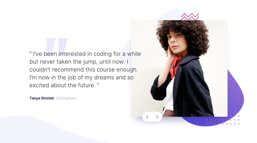
-I would suggest for you to add a stronger style to the clickable button so that it's easier for the user to know that there are more images, maybe adding a cursor: not allowed for disabled button would be nice.
-Another thing I see on sites with carousel is the possibility to change the image using the keyboard arrows, maybe you can implement that too
-
Add a larger margin to the image
-
The arrows should have no <button> tags as it is currently inaccessible by TAB
-
And add the background images, I think you must have forgotten 😅
Marked as helpful0@Al-Baraa-BakriPosted about 3 years ago@MarlonPassos-git I did this challenge without any focus HAHA :) Thanks For Your Helpful Feedback :)
1 -
Please log in to post a comment
Log in with GitHubJoin our Discord community
Join thousands of Frontend Mentor community members taking the challenges, sharing resources, helping each other, and chatting about all things front-end!
Join our Discord
