Design comparison
Solution retrospective
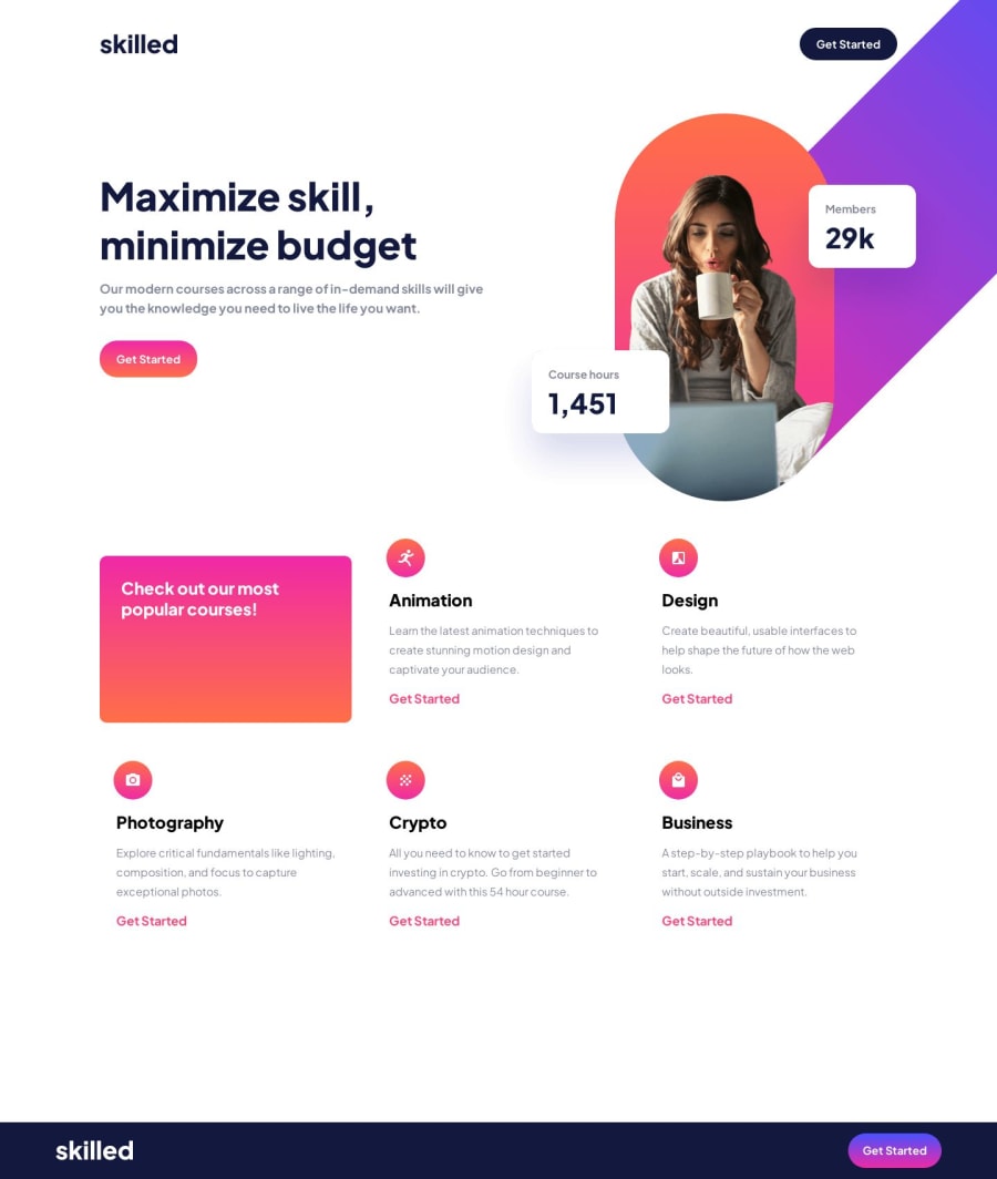
Hi, I have a huge problem with the images in background.. I don't know if my approach was good. I made on mobile an image as a background to an empty div, then in other breakpoints I made them to the body. I think that's not the best way to do that, so if anyone would like to check my code I would be very thankful :) I have also question about figma files. Should I use only "design system" typography? When I looked closer on each screen size there were different font sizes than in the design system. So my question is should I inspect every screen size or use only typography given at the beginning?
Community feedback
Please log in to post a comment
Log in with GitHubJoin our Discord community
Join thousands of Frontend Mentor community members taking the challenges, sharing resources, helping each other, and chatting about all things front-end!
Join our Discord
