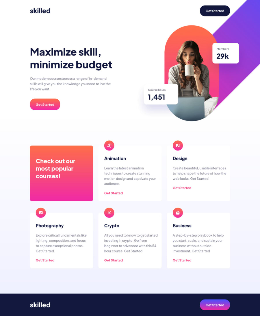
skilled-elearning-landing-page using css flex, clamp
Design comparison
Solution retrospective
The main chalenge of the project was to position the hero image properly. Because the image is trimmed differently for different screen sizes, but somehow I managed to do it)
Making hover effects for buttons was pretty time consuming, because transition didn't work for linear-gradient, so I used a trick with pseudo-element
Also I used CSS min function to make elements more responsive based on the viewport width and clamp to make responsive typography. But, these functions are not supported yet in some browsers.
What are the best practises of doing this kind of things like squishy paddings, margins, fluid typography so it would be as much responsive and cross-browser as possible? What should I add to my code?
Community feedback
- @Excelsior2021Posted almost 2 years ago
Hi @Nikitossik,
Well done for completing the challenge. I also struggled with the hero image.
For the buttons with linear gradients. What I did was use the opacity property and set it to 0.5 on hover, I believe it gives the effect that we want.
Marked as helpful0@NikitossikPosted almost 2 years ago@Excelsior2021 Hi, thank you for the comment, appreciate this
Actually I thought about just changing the opacity, but came up with pseudo-element trick, because the footer is dark blue, so the button will be darker as well if it's hovered. I just wanted the same gradient no matter what color background is and it took me a while to code this 😅
1@Excelsior2021Posted almost 2 years ago@Nikitossik Ah okay. Nice! I'll look into that too.
0
Please log in to post a comment
Log in with GitHubJoin our Discord community
Join thousands of Frontend Mentor community members taking the challenges, sharing resources, helping each other, and chatting about all things front-end!
Join our Discord
