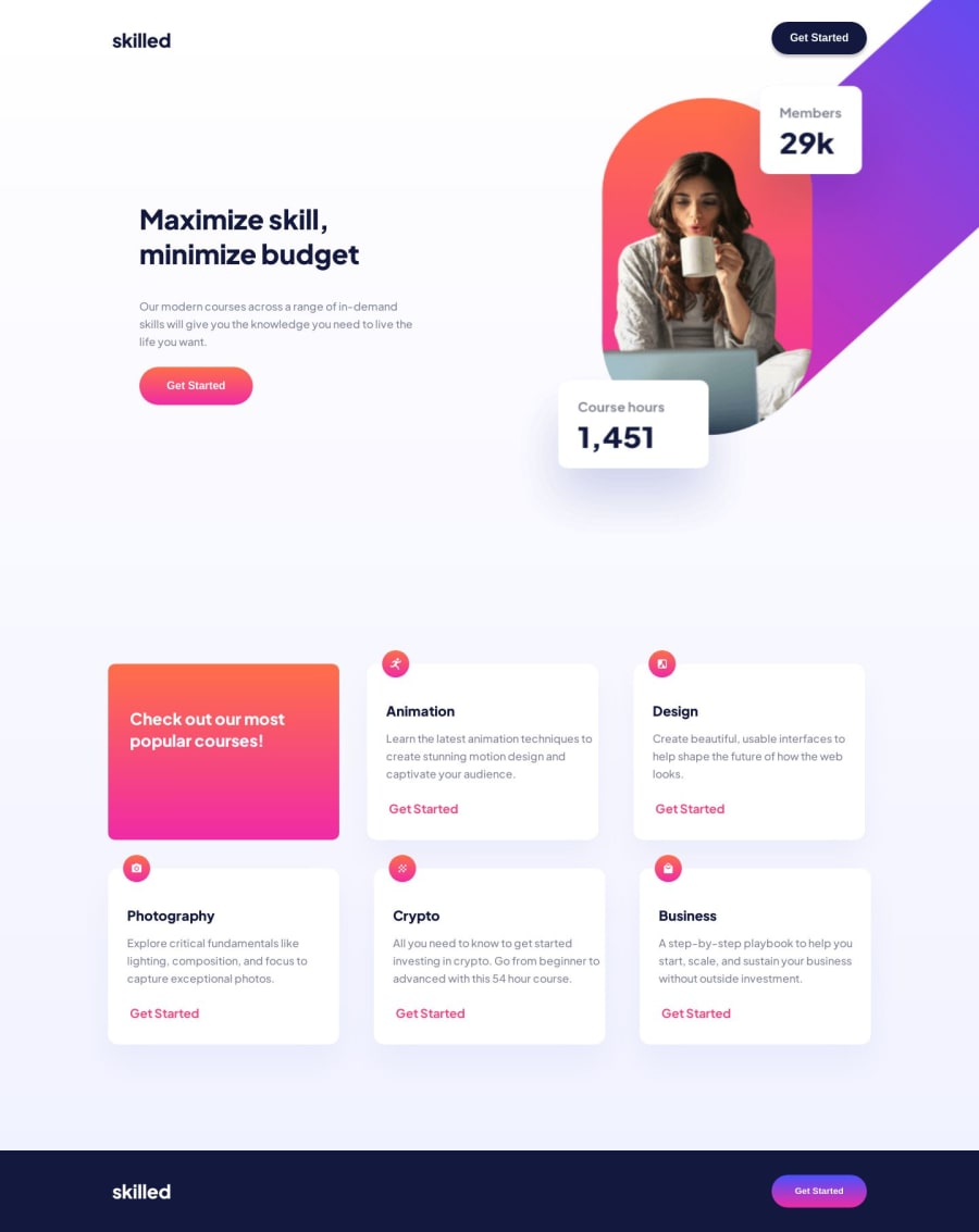
Skilled-e-learning-landing-page


Design comparison

Solution retrospective
Hello everyone!
Here is my first solution to the skilled-e-learning-landing-page.
I have a few questions...
I spent a ton of time switching between relative units like em, rem, % and fixed units like px. What are common elements that we use relative units for? What are common elements that we use fixed units for?
My image for the bigger screen sizes is a bit grainy but I used the fixed width and height that was given in the Figma files, can I do something different to make it a crisp photo again?
Media queries have been a struggle for me. What are the most common practices for media queries? 0-768px, 769-1024px. 1024px and above is what I went with for this project but I'm unsure if this was the best move.
Was position: relative the best way to get the desktop / tablet pictures to be located where I needed them to be? Did anyone do this different and achieved greater success?
In my rectangle container, mobile screen, my colorful div stays centered with a fixed width, but my rectangles getting stayed to the left of the viewport and continuously got bigger? Should I have kept them fixed or both growing in size?
I look forward to hearing from you all.
Thank you for your time,
Gerardo Garcia
Community feedback
Please log in to post a comment
Log in with GitHub
Join our Discord community
Join thousands of Frontend Mentor community members taking the challenges, sharing resources, helping each other, and chatting about all things front-end!
Join our Discord