skilled-elearning-landing-page


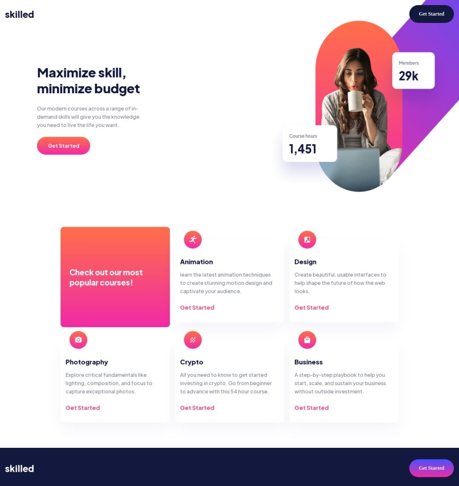
Design comparison

Solution retrospective
A lot of ideas were expressed in the code. Somewhat created a tailwindcss like utility in scss. Only problem was that I didn’t know how to express some-utility:desktop like media queries so this was abandoned. Also had a simple script that scaled the ui. Using font size of 10px on the body and writing everything in rem, you can use slope formula to scale your ui linearly. Could also use multiple regression in a similar way.
Any feedback on how to design this better. The image switching out to absolute positioning made this harder than it should be. The margins and padding are off I’m sure. This isn’t a perfect solution as this project made me quite frustrated. Didn’t feel like this was ‘newbie’.
Community feedback
Please log in to post a comment
Log in with GitHubJoin our Discord community
Join thousands of Frontend Mentor community members taking the challenges, sharing resources, helping each other, and chatting about all things front-end!
Join our Discord