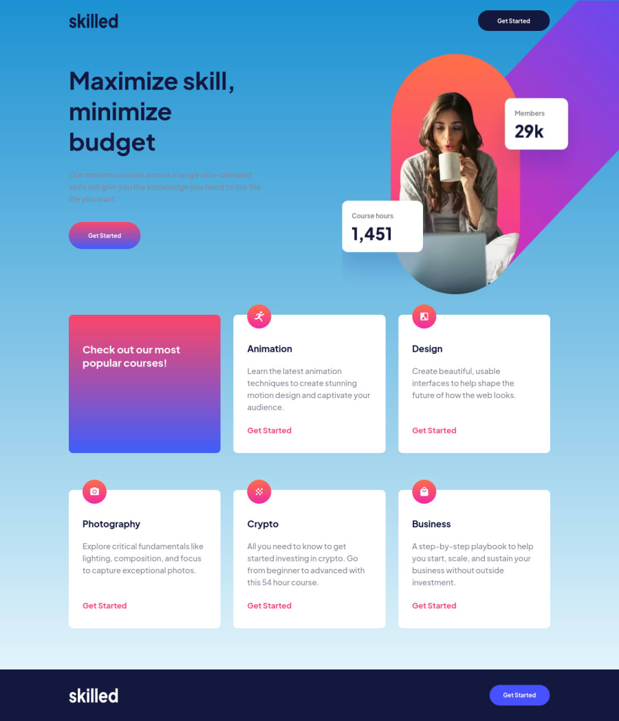
skilled landing page using html and css custom properties
Design comparison
Solution retrospective
I spend too much time doing this challenge and I would like to get some advice on how I could write my code to improve my productivity. I think it would be great if in my next challenge I use the ITCSS - architecture. Do you have other recommendations ? Or is there something in my codes that I could do better ?
Kind regards
Christ
Community feedback
- @grace-snowPosted about 2 years ago
Hi again
Overall this is really good!
I encourage you to really focus on thinking through html choice and user expectations. Think about what you expect when you use websites yourself and apply that to your solutions. Think about what the content would be if this was a plain document with no styling at all. Think about what people using keyboard or having the screen read out to them will experience. That knowledge will lift you from being an “ok” developer to being a “great” developer with high code quality.
Also, have devtools open on the side of your screen and zoom in/out as well as resizing the viewport to check what happens at different screen sizes (down to 320px at least and up to about 2000px)
Here is some feedback
- It’s not wrong but a common convention for site logos is for them to be wrapped in an anchor tag taking you back to the home page. If that’s done the image alt should say the name of the site and link destination like “Skilled - Home”
- Why is “Get started” a button element? What would you expect to happen on click? I would expect it to navigate to a sign up page, so would make this an anchor tag not button
- Only use a figure element when some content needs captioning. It is not meant to be used for all images
- The picture element code doesn’t look quite right. If using the srcset attribute you would need sizes attribute as well I think. And I wouldn’t expect a min and max width media attribute on there. The media should just go in one direction. Check MDN docs for more on the picture element in case I’m getting details wrong about srcset and sizes
- Don’t add whatever background you like on solutions. You may think this looks nice but you’ve made it inaccessible due to lack of colour contrast. For example I can’t read the opening paragraph at all as the text is grey on a blue background
- Why do you have aria-hidden on an image and sr-only class? That makes no sense at all
- Don’t overuse articles. Headings are enough to give structure. Articles are not designed for any content you think should be grouped, that’s what headings already give you. These are all cards under one h2, each with their own heading so just wrap them in divs. It’s rare that you’d need to wrap an article inside a section
- Correct the indentation in your code to make it consistent. This makes it much more readable and easier to find bugs. Your code editor should even be able to do this automatically for you.
- the icon images in this are decorative so alt should be left blank. However it’s worth noting for meaningful images that you’d never write alt text like that. Alt needs to be a brief human readable description of how an image looks. It is not a hyphenated string like computers read.
- In css, try not to use so many element selectors and nested selectors. Use single class selectors as much as possible, otherwise you are increasing specificity for no good reason and that can cause a lot of difficulties on larger projects
- No need to set both min width and max width on elements at the same time
- Try not to set explicit widths on elements except icons
- Line height should be unitless like 1.5 not in rem
- It’s extremely unusual to need to set height on elements like this
height: 16.1875rem;
I don’t know why that’s there. Let the browser choose how tall something needs to be based off the space available. It’s almost always going to cause bugs for some users when you set explicit heights (and often with explicit widths too as the browser can’t respond to available space) - When setting media queries don’t set min and max width, just go in one direction (min-width). This will have problems on huuuuge screens at the moment as it would flick back to a smaller screen layout (over 90em)
I hope this is helpful. I know it looks a lot but these are base understanding things that won’t take long to learn and embed
Marked as helpful2@Christ-KevinPosted about 2 years agoI can't say thankyou enough for your comment @grace-snow. This is a big help for me
0 - @AdrianoEscarabotePosted about 2 years ago
Hello Christ Kevin Touga Watat, how are you?
I really liked the result of your project, but I have some tips that I think you will like:
I noticed that at higher resolutions the elements are stretching a lot you could put a
max-width
of 1440px for example. This would help keep the design that turned out very nice by the way, intact!If you have any doubts about how to hold the content, you can look at my resolution of this challenge!
The rest is great, your personalization was very good!!
Hope it helps...👍
Marked as helpful1@Christ-KevinPosted about 2 years ago@AdrianoEscarabote Thankyou so much for your comment Adriano
0 - @LorisDucampsPosted about 2 years ago
Hi Christ Kevin Touga Watat,
The challenge is quite well done. Cheer !
Be careful to respect the proportion of images in CSS.
Don't worry about the different CSS architectures for now.
Remember to structure your code well and try to respect the model as closely as possible.
I opened a first pull request for this project.
Good luck
1
Please log in to post a comment
Log in with GitHubJoin our Discord community
Join thousands of Frontend Mentor community members taking the challenges, sharing resources, helping each other, and chatting about all things front-end!
Join our Discord