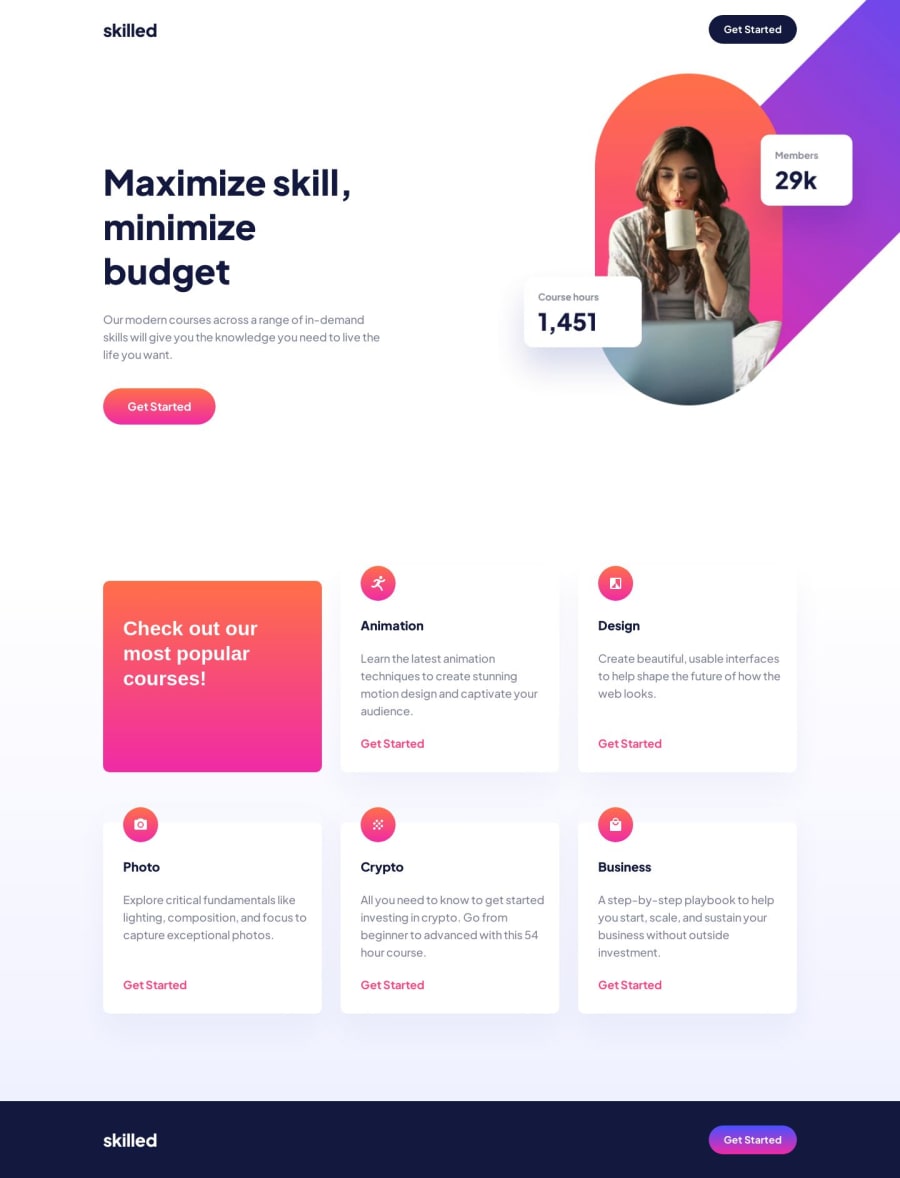
Design comparison
Solution retrospective
I learned a little bit more about positioning elements on the right edge so that they do not create a scrollbar if they are too large.
I learned that declaring the width of the parent element and then using overflow hidden will clip the image at the width of the parent container. This was great for me to learn. However, due to absolute position and then moving the element with top and left the image does not scale correctly. I can not figure out how to get the image to scale and utilize overflow hidden at the same time. Either the image creates a scrollbar (overflow not hidden) or the image does not scale (absolute position, left and top).
Would like feedback on this.
Community feedback
- @itushPosted over 1 year ago
Congratulations on completing the challenge! 🎉
Your solution looks nice to me.
It is important to correctly understand CSS Position property to render HTML elements as per the requirement. I remember struggling in my initial projects, since I didn't understand it correctly😁 Please note:
-
By default, all HTML elements are static (non-positioned elements).
-
By using top, right, bottom, left we can control the final location of an HTML element.
-
Top, right, bottom, left, z-index don’t have any effect on Statically positioned / non-positioned elements.
-
So, basically, we first need to convert a non-positioned element to a positioned element using (relative/fixed/absolute/sticky) then only (top/right/bottom/left/z-index) etc. will work for the targeted element.
Feel free to checkout: 📚🔍 12 important CSS topics where I discuss about css position, z-index, box-model, flexbox, grid, media queries, mobile-first workflow, best practices etc. in a simple way.
I hope you find it helpful🤞
Keep up the fantastic work and happy hacking! 💪✨
Marked as helpful1@roodhousePosted over 1 year ago@itush Thank you! So with my setup how do I keep the image appended to the right of the screen? At 1440 it fits perfect, at 1441 a 1px space appears to the right of the image. If I increase the parent div width by 1px then that space is gone and it looks correct again. At 1440 if I remove the overflow property from the parent then I can scale just fine, but I have a scrollbar that extends to the end of the width of the image.
0@itushPosted over 1 year ago@roodhouse I understand the issue, but I'm afraid that the solution is rather boring one.
-
First the topImage div is positioned absolute on 'md': '768px' and above, then different top and left is applied to push the same image to the right edge of the screen so that there is no gap to the right of the image and that too for different breakpoints.
-
Please note: There are tons of screens and devices with different heights and widths, so it is hard to create an exact breakpoint for each device. To keep things simple we target the typical five groups of breakpoints and 1440px does not belong to this group. However, You can add as many breakpoints as you like to make it more responsive.
-
There is no need to use xl:max-w-[991px] and xl:w-[991px] both for the DesktopImage.
-
To display the image to extreme right of the screen for breakpoints other than default breakpoints you need to add each custom screen manually in tailwind.config.js and then calculate and apply different top and left (in the same fashion you did for other breakpoints) to the topImage div separately for all custom screens.
-
If you find a better solution kindly let me know :)
Marked as helpful0 -
Please log in to post a comment
Log in with GitHubJoin our Discord community
Join thousands of Frontend Mentor community members taking the challenges, sharing resources, helping each other, and chatting about all things front-end!
Join our Discord
