skilled elearning whit tailwind, shadcn ui, typescript and react
Design comparison
Solution retrospective
I'm glad I started customizing the Shadcn UI components.
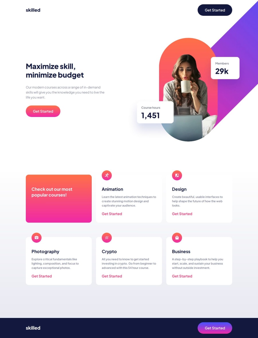
What challenges did you encounter, and how did you overcome them?As always, positioning large images with absolute is a problem for me, the layout breaks between breakpoints. In this exercise, I wanted to try using translate to position the image and prevent other components from overlapping it or the image itself from overlapping other components.
Even though I positioned the image correctly, when I use absolute I have issues with the layout, I have to manage it at every breakpoint, otherwise it breaks. In any case, it often happens that the layout breaks between breakpoints. This time, I wanted to try using only translate to position the hero image, which is definitely better than using absolute, but the issue of the layout breaking remains. Between breakpoints, the image ends up underneath other components like the navbar or the cards section. I don’t understand what I’m doing wrong, or maybe I need to check the image positioning at each breakpoint.
The component in question is HeroImage.
Community feedback
Please log in to post a comment
Log in with GitHubJoin our Discord community
Join thousands of Frontend Mentor community members taking the challenges, sharing resources, helping each other, and chatting about all things front-end!
Join our Discord
