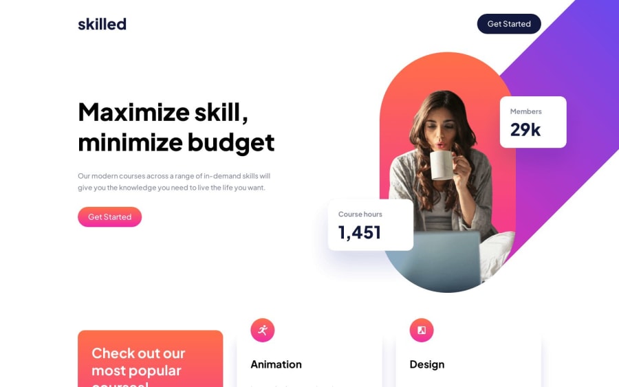
Design comparison
Solution retrospective
I have some of questions
- How to properly position the image?
I used absolute positioning, but I've been told it's not the proper way of positioning.
- How to stop
gridfrom stretching?
When my 3 columns become 2, there is white space on the right side of my cards which is not my gap. How do I stop this from happening? I tried aligning, placing and justifying my items everywhere but nothing seemed to work.
- What's causing the screenshot to not be full?
Of course all feedback is welcome and as always thank you for looking at and correcting my code.
Community feedback
- @rupali317Posted 11 months ago
As for your second question, "When my 3 columns become 2, there is white space on the right side of my cards which is not my gap. How do I stop this from happening?"
Could it be because of this line in your code?
Maybe the max-width is preventing the card from having a width beyond the mentioned max-width
.card {
    max-width: 21.875rem;
}
Marked as helpful0@Mitko90Posted 11 months ago@rupali317 I actually don't want them to be wider than
22rem. They don't look good. That's why I gave themax-width. But that made me realize how stupid I was and that in some screen sizes1fris going to be wider than22remand that was the white space on the right. So I just changed the value in thegrid-template-columstominmax(15rem, 21.875rem)so they don't get wider, but they have room to narrow down if needed. It solved my issue. Anyways I'm marking you as helpful because your comment made me think and then I solved my problem. Thanks1 - @rupali317Posted 11 months ago
Hi @Mitko90
You can try the following to position the image:
Remove the position:absolute and add a negative margin to the card-img. Absolute positions can be harder to maintain, and be problematic for responsiveness. Also for accessibility, it can be hard for assistive technology to understand the relationship between the positioned element and the rest of the content.
.card-img {
  margin-top: -4rem;
}
Ofcourse, you may need to adjust the height of your card accordingly. You might have to add a max-height to your
.cardclassLet me know if the above suggestion related to the positioning of the image works!
Also, your site is rendering well in my browsers (I tried Safari, Chrome, and Firefox). I also tried it on my mobile. I am not able to see that white content.
Marked as helpful0@Mitko90Posted 11 months ago@rupali317 I was asking about the big image, but thanks anyway. I'll update the icons as well.
I also tried different browsers and devices, I don't know what's the problem with the screenshot.
0@rupali317Posted 11 months agoI see, thanks for the clarification @Mitko90
This is my suggestion:
- Remove the
position:relativefrom.heroclass - For desktop and tablet mode,
.hero.containerclass will have the styles:display:flex;justify-content:space-between;and for mobile mode.hero.containerclass will have the styles:flex-direction:column; - For the desktop version
.hero divclass will havemin-width: 29rem;and for tablet version.hero divclass will havemin-width: 21rem; .hero-desktopand.hero-tabletclass -> please remove theposition: absolute. For.hero-tabletclass, apply a negativemargin-top: -16rem;and.hero-tabletclass has negativemargin-top: -12rem;
I am avoiding the usage of position absolute and relative as much as possible. Please give it a try and let me know! If you have any clarification for the above, please let me know
Besides that, some of my general suggestions would be to start from mobile and then use min-width: <number>rem to accommodate tablet and then desktop
You may also want to consider using <picture> element since it is better for performance and helps you to write cleaner code. Because right now, you are showing the images for all the 3 modes: mobile, tablet, desktop. You are writing extra code like display:none and display:block to hide and show the images based on the device width.
Do give the following a read: https://fedmentor.dev/posts/html-plan-product-preview/#product-image
In the above section, Grace talks about the benefit of using <picture> element
For the white content, you might want to ask the Frontend mentor team since it renders perfectly on the various devices and browsers that I tried
0 - Remove the
Please log in to post a comment
Log in with GitHubJoin our Discord community
Join thousands of Frontend Mentor community members taking the challenges, sharing resources, helping each other, and chatting about all things front-end!
Join our Discord
