Submitted almost 2 years ago
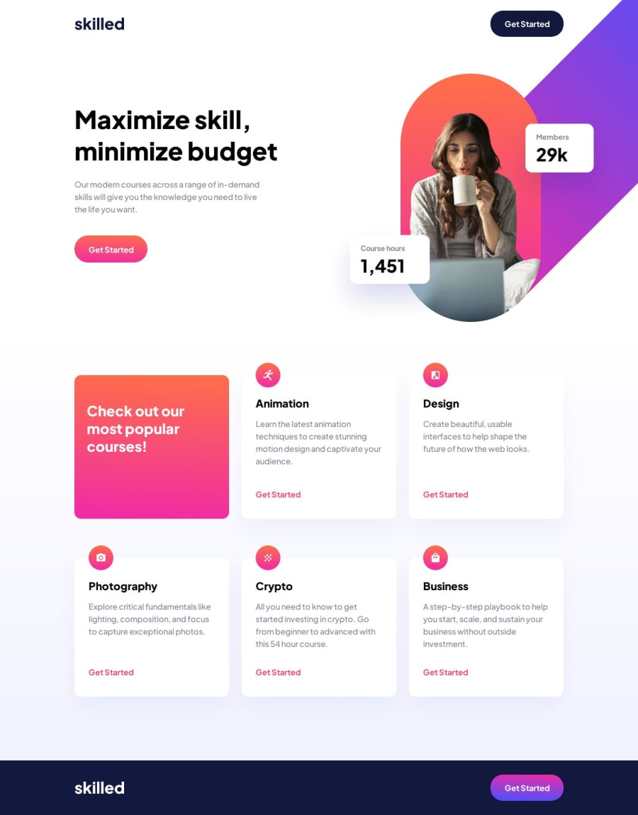
Skilled elearning landing page with SCSS/BEM
#sass/scss#bem
@ruuen
Design comparison
SolutionDesign
Solution retrospective
This challenge was completed almost a year ago, so I am quite happy with the work after taking a break to work on backend learning.
The asset provided for the mobile hero image had extra whitespace at the bottom and clipping of the box shadows which did not look great. The tablet image also had a similar problem with the skewed rectangle being larger than required which made styling it in a responsive manner hard without small hacks.
As a result I decided to re-export the assets from Figma & build the text elements with CSS, and I think this turned out really well.
Community feedback
Please log in to post a comment
Log in with GitHubJoin our Discord community
Join thousands of Frontend Mentor community members taking the challenges, sharing resources, helping each other, and chatting about all things front-end!
Join our Discord
