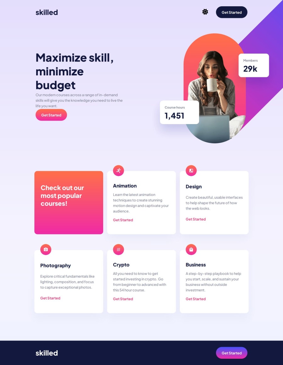
Skilled elearning landing page with DarkMode (HTML + CSS + JS) 👨💻
Design comparison
Solution retrospective
👨💻 Hello guys.
This is my solution to this challenge. It was a lot of fun and challenging to do this project, at times I had complications with the positioning of the hero image, but I think I did a good job. I would like to thank my friend @correlucas for giving me the opportunity to do a premium project.
Tamo junto man 🇧🇷
I added some details:
- 🎨Dark mode and light mode
- 👨🎨Images hover effect
Feel free to leave feedback on how I can improve my code. 😊
Thanks!
Community feedback
- @correlucasPosted about 2 years ago
Fala Adriano, parabéns pela nova solução!
Nessa ai você se superou, seja nos efeitos de hover (que ficaram bem lokos) que no dark mode, além da página toda estar full responsiva, provavelmente essa é a melhor solução pra esse desafio, ficou bem completa.
A unica dica que eu tenho pra vc é alinhar o botao de dark mode a direita do botao e usar um CSS RESET pra economizar tempo é usar um CSS RESET, pro arquivo de estilo CSS e copiar e colar esse reset padrão que reseta varios comportamentos default do CSS que são um pouco chatos de usar, como margens, imagens, animações e etc. Vai salvar um bom tempo usar isso desde o começo: https://piccalil.li/blog/a-modern-css-reset/
Parabéns lek!
Marked as helpful0@AdrianoEscarabotePosted about 2 years ago@correlucas Obrigado man.
Valeu pela dica começarei a usar tudo que for salvar meu tempo, porque para posicionar essa hero image, já foi metade dele kkkkkkk
0@correlucasPosted about 2 years ago@AdrianoEscarabote Boa tbm, tive mto problema posicionando essa. Em relação aos icones, vc pode achar uns icones mais bonitos usando o site
flaticon.com
ou entao ir na abacommunity
do figma e buscar por design system e icones que vai ter uma lista de varios icones svg pra usar.Marked as helpful0@AdrianoEscarabotePosted about 2 years ago@correlucas Nossa valeu kkkk eu tava procurando isso, mas só achava lugar que o sol parecia uma engrenagem.
0 - @flozzy99Posted about 2 years ago
Hey Adriano, I really like your design, especially some details that you add, Well done! I have a curious question 😅, how long take you to complete this challenge?
2@AdrianoEscarabotePosted about 2 years ago@flozzy99 thanks! I think it took me 3 days, I had some difficulties positioning the hero image ahuahuha
2 - @kanuosPosted about 2 years ago
@correlucas Hi Adriano, your design looks impeccable. However, as you probably have observed, the design has a prominent
linear-gradient
background which fades from bottom up, whereas in your solution that gradient isn't that prominent. Was that something you did deliberately as your own variation?1@AdrianoEscarabotePosted about 2 years ago@kanuos Yea! I really liked this effect, I put it because I felt that some detail was missing at the top of the page.
0 - @DavidMartelCloutierPosted about 2 years ago
I really like the little personal touch you added.
0
Please log in to post a comment
Log in with GitHubJoin our Discord community
Join thousands of Frontend Mentor community members taking the challenges, sharing resources, helping each other, and chatting about all things front-end!
Join our Discord