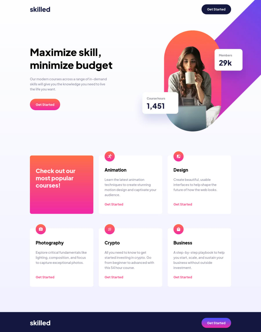
Skilled E-Learning Landing Page - Vue - TS - SCSS
Design comparison
Solution retrospective
Hello Fellow Coders, This is my solution to the Skilled E-Learning Landing Page. For this project, I have used Vue, TypeScript, and SCSS for the styling. I have turned off all default styles to be able to control better the styling myself. I used layouts with slots to practice these Vue features. At first, I had an issue with the hero section image and its position since it was overflowing and affecting other parts of my code., but towards the middle, I was able to solve this positioning problem.
I will continue to do more projects using Vue, TS, and SCSS and practice different methods. If you have any suggestions, tips, or tricks please let me know, feedback is always welcome.
Community feedback
Please log in to post a comment
Log in with GitHubJoin our Discord community
Join thousands of Frontend Mentor community members taking the challenges, sharing resources, helping each other, and chatting about all things front-end!
Join our Discord
