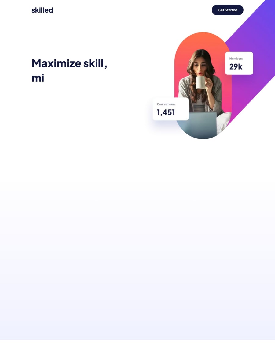
Design comparison
Solution retrospective
I had to deal with some weird overflow bugs, I think I got them, but if there are any left please let me know!
Community feedback
- @bbsmoothdevPosted 10 months ago
Wow, this is really impressive. What a cool added touch. Great job.
I specialize in accessibility, so I'm going to give you some feedback on how to improve the accessibility of your page. Please don't take anything I write below as a negative view of your page. I really like it. I just am going to suggest some things to help make your page more enjoyable for everyone.
First, I am very impressed with how responsive it is. The test is to set the width of the page to
1280px
and then zoom in400%
. To be honest, with the added animation I was not expecting your page to handle400%
zoom but it did great. A few words were just slightly cut-off at the edge, but I could still read them. And the animation still worked as it should and I could read the content when the images popped-up. Granted, I could only see part of the images, but I don't consider that an accessibility fail since those images are purely decorative.Concerning those images, there is one accessibility issue with them. Whenever content appears on mouse hover, and that content covers other content on the page, then you must be able to make the pop-up content disappear without moving your mouse. This means that you need to be able to make it disappear using the keyboard. Generally you do this by configuring the
Esc
key to close the pop-up content. If your JS skills aren't quite up for that yet I understand. I just wanted to point this out because most people don't know about this accessibility requirement.And one other thing about the image animation. To be nice, it is considered a best practice to allow people to turn off the animations. There is a media query called
prefers-reduce-motion
that you could use to only activate the animations if the user doesn't have it set toreduce
. Or you could add a switch to the top of the page that allows people to toggle them on/off. I know the design doesn't call for that, but in the real world, designers don't always get their way.Another accessibility issue is the heading structure. You do have one
h1
near the top, which is perfect. But you have other sub-headings on the page that aren't marked up as headings in the HTML. I think "Check out our most popular courses!" is just crying out for anh2
. And then all of those popular courses that follow would beh3
s.Concerning that
h1
, in order to create the effect, you wrapped each letter in apre
element. I just listened to that with a screen reader and it caused my screen reader to read each letter one at a time instead of reading the actual words. Very annoying. I would solve this by having a "real"h1
heading that just has the words "Maximize skill, minimize budget" in it (without thepre
elements) and visually hide it with CSS (google 'visually hidden CSS' if you aren't familiar with this concept). That way it is there for screen reader users but you won't see it on the page. And then with your currenth1
you can add the attributearia-hidden="true"
to it, which will hide it from screen reader users but allow it to be seen on the page. Now you have the best of both worlds. And unless this effect depends on that being anh1
, it doesn't need to be marked up as a heading at all, just use adiv
.Nice alt text on the image at the top. For the pop-up images, I would consider them all to be decorative and would give them all empty alt text (
alt=""
).Again, great job with this. Enjoyed it a lot.
Marked as helpful1
Please log in to post a comment
Log in with GitHubJoin our Discord community
Join thousands of Frontend Mentor community members taking the challenges, sharing resources, helping each other, and chatting about all things front-end!
Join our Discord