Submitted almost 2 years ago
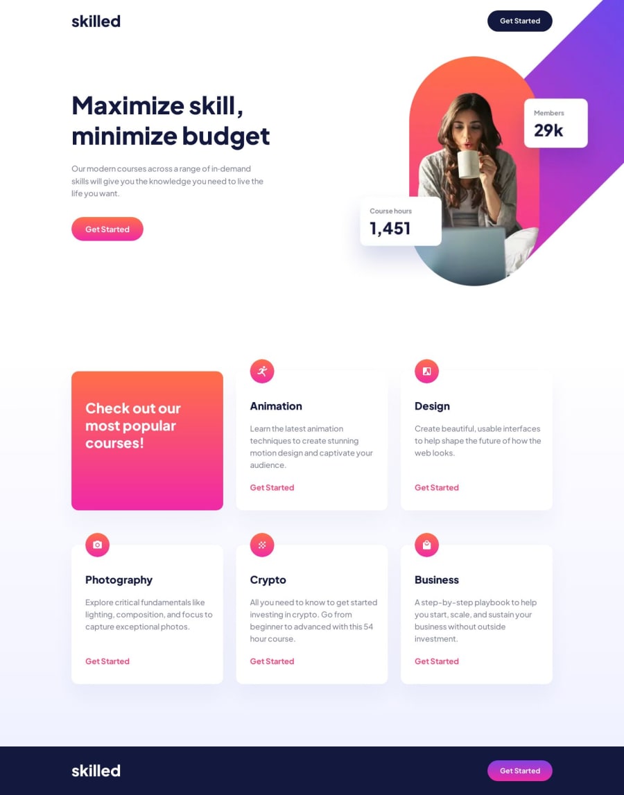
Skilled e-learning landing page solution
#bem#smacss#sass/scss
P
@Dantalian5
Design comparison
SolutionDesign
Solution retrospective
Hi there!
What I learned:
- <picture> tag and its uses, "resolution switching" and "art direction" cases, the importance of these when working with images in Frontend development.
What I practiced:
- the use of "z-index" in a practical way,
- the implementation of a flex layout of two and three columns in a fluid and dynamic way.
Difficulties:
- The hero image was my biggest difficulty at all times, I couldn't find a way to integrate it "dynamically" into the layout, besides using "overflow: hidden" and "z-index:-1" to achieve the desired effect was only thanks to a bit of brute force in the code, which made it even more difficult to "flow" the page.
Community feedback
Please log in to post a comment
Log in with GitHubJoin our Discord community
Join thousands of Frontend Mentor community members taking the challenges, sharing resources, helping each other, and chatting about all things front-end!
Join our Discord
