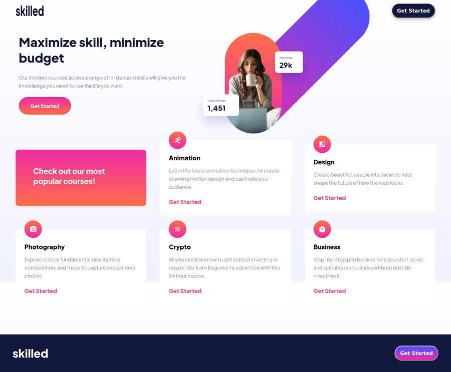
Design comparison
Solution retrospective
I need help to position the image
Community feedback
- @DesignAssemblyPosted over 2 years ago
Hi Isaac dont overthink the positioning, there are many ways to solve it. I just used negative margins to position the image. To get consistency in the height of your "cards" usilize css grid or flexbox. I used css grid which gave me the good control over what it is I wanted to achieve.
Happy Coding
0 - @phaethonPosted over 2 years ago
I used flexbox with main content and hero image, and then used transform/traslate to move the image out of the flexbox item position to the top and right. One issue with your design is that it does not break at the same time - cards switch to 2 columns before the image is changed to the tablet image. I used large column-gap to prevent this. It then gets changed to desired column gap width at the same break condition when image is changed. Thus columns change from 1 to 2 at the same time as image changes. Hope this helps!
0
Please log in to post a comment
Log in with GitHubJoin our Discord community
Join thousands of Frontend Mentor community members taking the challenges, sharing resources, helping each other, and chatting about all things front-end!
Join our Discord
