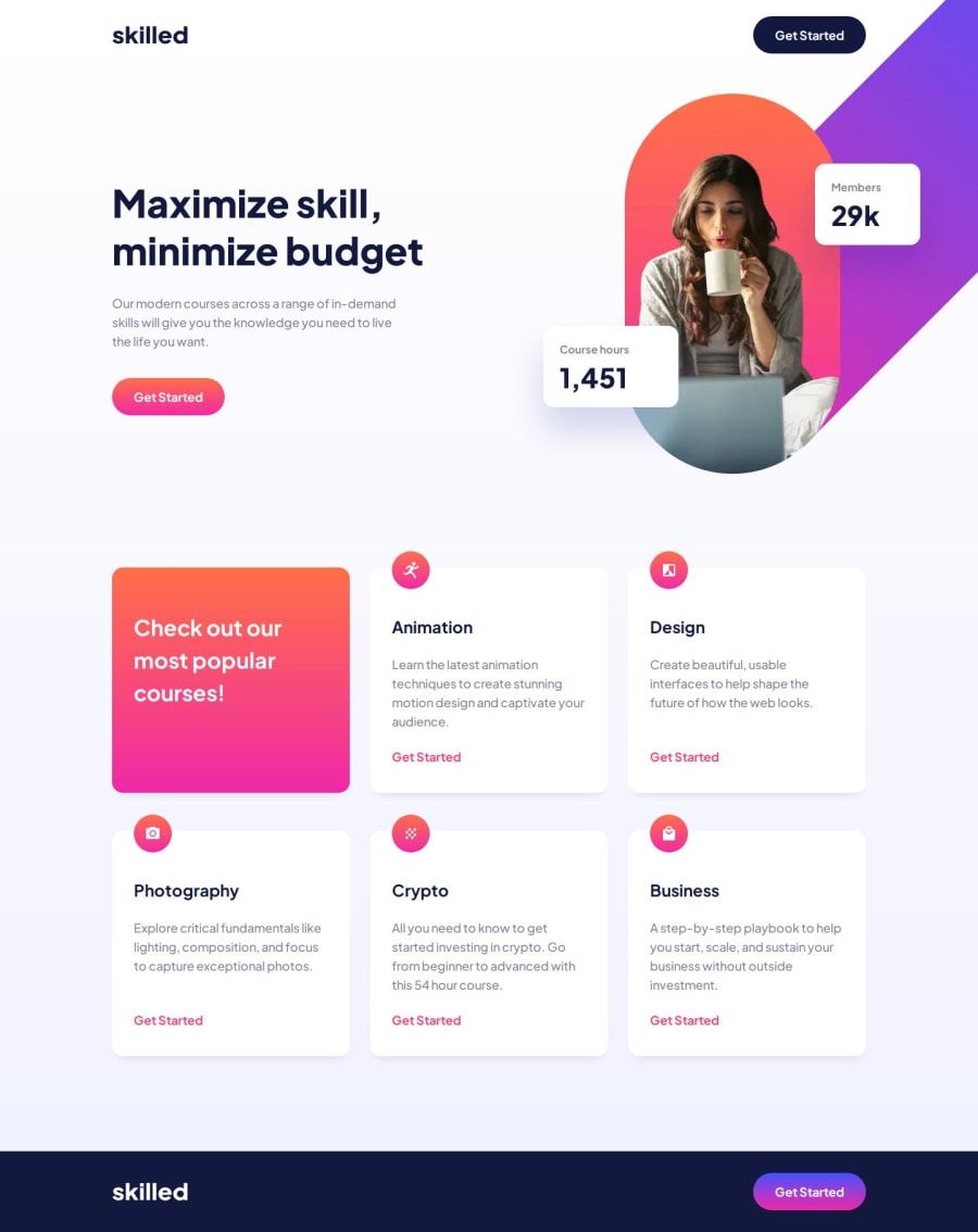
Design comparison
SolutionDesign
Solution retrospective
What are you most proud of, and what would you do differently next time?
-
For this project, I'm most proud of successfully integrating SCSS into my workflow. Creating reusable @mixins for colors and buttons really streamlined the coding process and kept the stylesheet DRY.
-
I also took to heart the BEM methodology for class names, which has significantly improved the readability and maintainability of my CSS.
- If I were to do anything differently next time, I'd invest more time in planning the responsive aspects of the layout earlier in the process. Adjusting components for mobile views was more challenging than I anticipated, and adopting a 'mobile-first' approach from the start seems like it would be more efficient. Additionally, I'd like to dive deeper into more complex SCSS features, like loops and functions, to see how they could further enhance my coding efficiency.
- As for the final product, I'm still not entirely comfortable with my code. The mobile version didn't turn out as robust as I would like, and wrestling with overflow-x: hidden; was particularly tough. It's clear I still have room to grow in creating fully responsive designs without resorting to quick fixes.
Any feedback on these points would be greatly appreciated ;)
Community feedback
Please log in to post a comment
Log in with GitHubJoin our Discord community
Join thousands of Frontend Mentor community members taking the challenges, sharing resources, helping each other, and chatting about all things front-end!
Join our Discord
