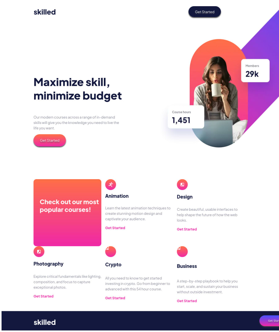
Design comparison
SolutionDesign
Solution retrospective
Any help and advice is greatly appreciated. I am still learning and haven't worked with SVG files yet. The icons given are not the same as the icons shown in the Design mock-up. I have a fairly good grasp on how CSS Grid and CSS Flex works but still need practice aligning stuff and best practices.
This is my third project since learning HTML and CSS the first two were just basic "cards".
- Tablet & Mobile not finished *
- Working on aligning a few items, cleaning up my code and making it responsive *
Community feedback
Please log in to post a comment
Log in with GitHubJoin our Discord community
Join thousands of Frontend Mentor community members taking the challenges, sharing resources, helping each other, and chatting about all things front-end!
Join our Discord
