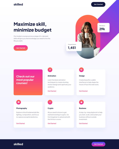
Submitted over 1 year agoA solution to the Skilled e-learning landing page challenge
Skilled ELearning Landing Page
@yas-avocad

Solution retrospective
What challenges did you encounter, and how did you overcome them?
I'm having problems with the smooth transition between screen sizes. With the absolute image, the text on the side runs together with the hero.
What specific areas of your project would you like help with?How to make the main text and image hero not run into each other when changing the browser size.
Code
Loading...
Please log in to post a comment
Log in with GitHubCommunity feedback
No feedback yet. Be the first to give feedback on yas-avocad's solution.
Join our Discord community
Join thousands of Frontend Mentor community members taking the challenges, sharing resources, helping each other, and chatting about all things front-end!
Join our Discord