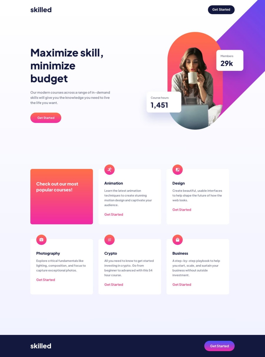
Design comparison
Solution retrospective
I finally figure out positioning images without dealing with a scrollbar. Overflow clip margin came to the rescue, so far, positioning was one of my weakest skills but I'm glad I figured it out. I wonder why that propertie was difficult to find when googling. For some reason it worked on day and the next it didn't unless I defined it as 0. No idea why. I originally started with a desktop first design, but after feedback on my last challenge and I restarted it in a mobile first mindset. I actually enjoy this method more. I'm having less issues scaling up. Not sure when it's best to use CSS resets so I didn't use it here. I used grid for the first time in this project and I had many issues with scaling that up, so maybe for those properties it would've been for the best. So I want to practice that more of that in the future. Any feedback would help! I tried to implement all the notes I had for my last challenge!
Community feedback
Please log in to post a comment
Log in with GitHubJoin our Discord community
Join thousands of Frontend Mentor community members taking the challenges, sharing resources, helping each other, and chatting about all things front-end!
Join our Discord
