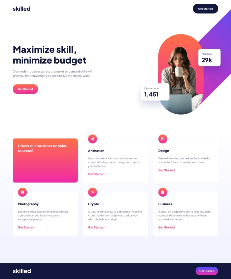
Design comparison
Community feedback
- P@lynx232Posted 2 months ago
Does the solution include semantic HTML?
- Yes!
Is it accessible, and what improvements could be made?
- It is! Still, I suggest you use a predefined modern reset, it makes your job easier. I prefer A Modern CSS Reset - Josh W Comeau;
Does the layout look good on a range of screen sizes?
- Yes! Great job on making div.hero-img look good on every range of screens!
Is the code well-structured, readable, and reusable?
- Yes! I like the use of comments for organizing your code.
Does the solution differ considerably from the design?
- It doesn't, except for logo at the bottom, you should make it the same size as the one at the top. Other than that it looks great!
- Also, the color on hover for the bottom button doesn't resemble the design file(if you find a solution to this problem, please let me know, as I also don't have a fix for this as of now)
Great job on this project. I would also like to ask to review as many solutions on this website as possible, so that we could all continue to improve, also please encourage other to do the same.
Best of luck on your journey! 🍻
1
Please log in to post a comment
Log in with GitHubJoin our Discord community
Join thousands of Frontend Mentor community members taking the challenges, sharing resources, helping each other, and chatting about all things front-end!
Join our Discord
