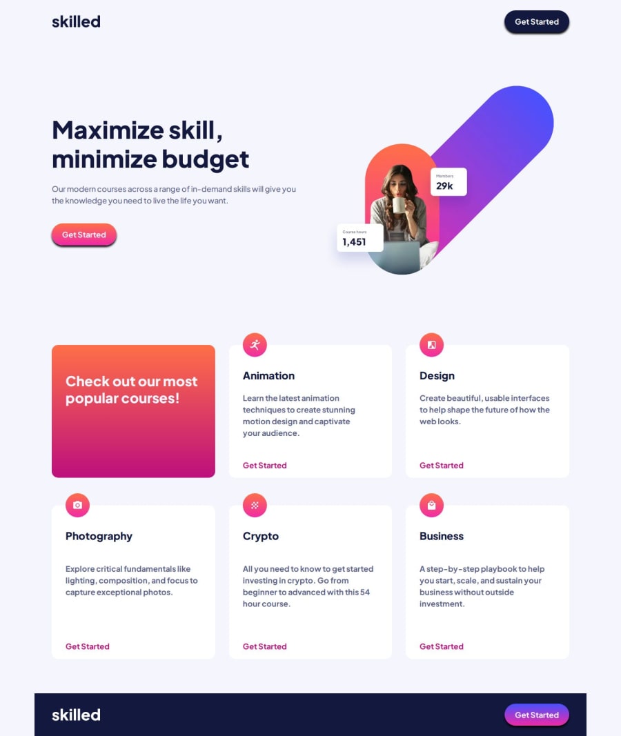
Skilled E-learning Landing Page
Design comparison
Solution retrospective
Pretty satisified with the result.
What challenges did you encounter, and how did you overcome them?It went fairly well I think.
What specific areas of your project would you like help with?As always, I'm open for suggestions!
Community feedback
- @grace-snowPosted 3 months ago
Nice solution!
A few things I spotted that should be fixed though:
- The logo image
altsays "Logo Skilled, to homepage" which doesn't make sense. It should just say "Skilled" or "Skilled (logo)". It's not a link, it's just an image of a logo and must begin with the text shown / name of site. - The hover styles on the buttons are failing minimum contrast ratios. They need to remain readable (4:5 colour contrast ratio).
- I don't think that hero image is decorative. It looks like important content, especially as it includes some relevant text. Update the
alt. - The repeating "Get started" links need more context for screen reader users. They would currently fail WCAG 2.2.4 Link purpose (in context), level A, because they don't describe their destination when someone browses links on the page. To fix, add in relevant sr-only (visually hidden) text inside the link. For example:
<a href="#">Get started<span class="sr-only"> - Animation</span></a>.
Marked as helpful1P@Islandstone89Posted 3 months ago@grace-snow Thanks for the feedback, much appreciated!
-
The reason I had "Logo Skilled, to homepage" was that I just read this article from a web accessibility specialist . You're right that it's just a logo, so I changed the alt text to "Skilled(logo)".
-
I did wonder about the hover styles having poor contrast. I dislike when the challenges have poor contrast in their design! I had to change the color of "Get Started" in the cards because it had poor contrast. I have adjusted the opacity, and made the saturated blue applied on hovering the header button slightly darker. DevTools says it has a ratio of
6.98, so at least that one should be good to go! -
I missed the text in the hero image, alt text is added.
-
Great point about "Get Started" being vague - I have added additional text, wrapped in a
visually-hiddenutility class.
1 - The logo image
Please log in to post a comment
Log in with GitHubJoin our Discord community
Join thousands of Frontend Mentor community members taking the challenges, sharing resources, helping each other, and chatting about all things front-end!
Join our Discord
