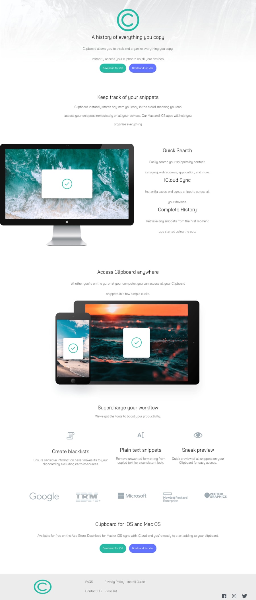
Design comparison
Solution retrospective
Its not 100% responsive but what do you think of the desktop's version?
Community feedback
- @ChamuMutezvaPosted over 3 years ago
- you are missing an
h1element - it is important to have one and only one in a site. - the unordered list in the footer section must be interactive (
aelement) they are supposed to be links to external pages of links to some section on the page. <p id="lista">Install Guide</p>, this should have been part of the list as well- some content are being cut off especially from about 376px , with the google , ibm images hardly visible. Hence the site is not responsive (388px to 550px)
Marked as helpful0 - you are missing an
- @Comet466Posted over 3 years ago
nice job on this challenge guillermo, im gonna point out a few details so you can work on then and make your solution better
-
in the workflow section the cards container is uneven, the first card got more space that the other making it not look a little off, you can fix these by declaring
flex:1on each .card container, doing this every card would take the same amount of space -
you declared two rows in the footer but you only really need one row, and center the social media icons, doing so the solution would look more like the intended solution
-
you should add the pseudo class :hover to your bottoms to make them more interactive for your user
hope to had helped you, keep coding
Marked as helpful0 -
Please log in to post a comment
Log in with GitHubJoin our Discord community
Join thousands of Frontend Mentor community members taking the challenges, sharing resources, helping each other, and chatting about all things front-end!
Join our Discord
