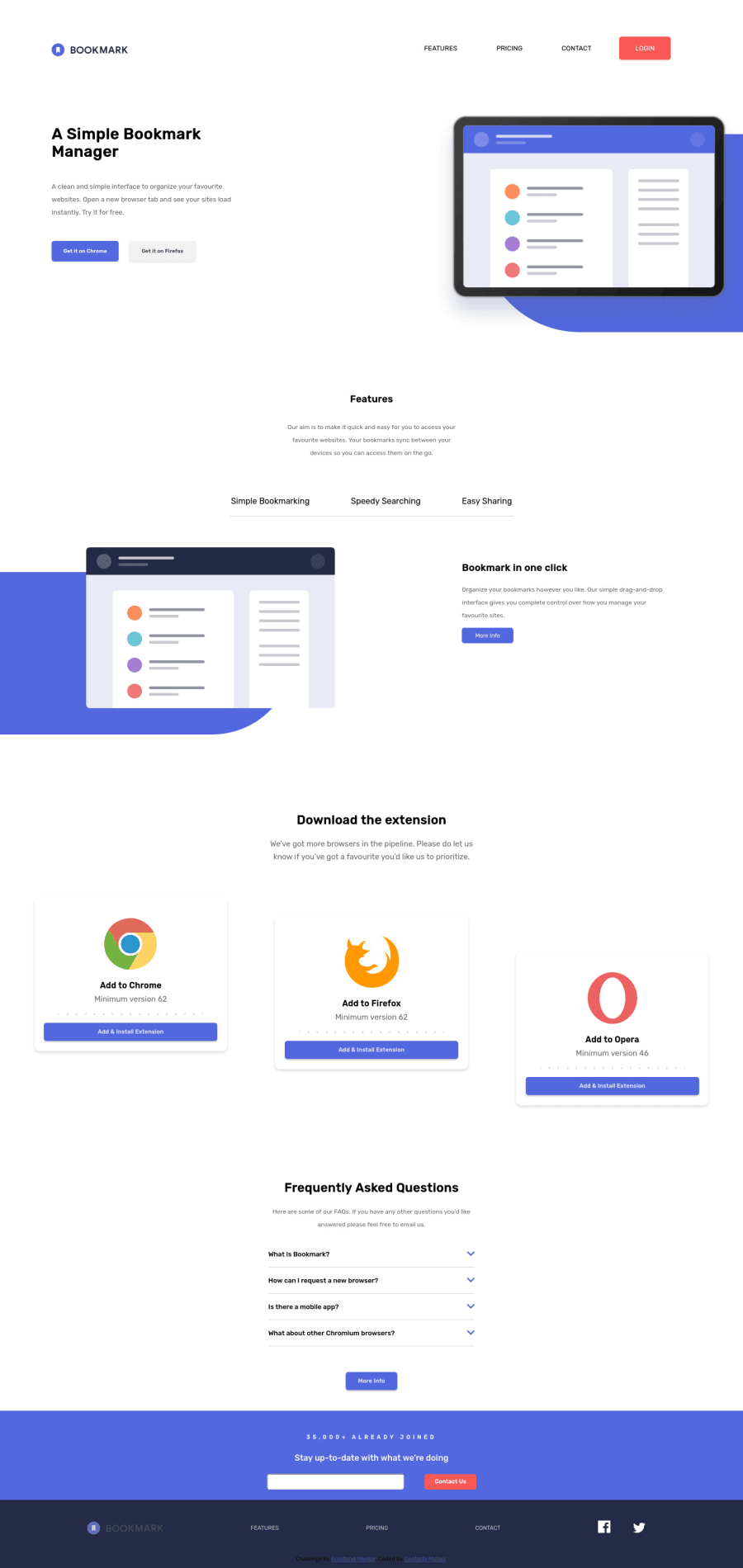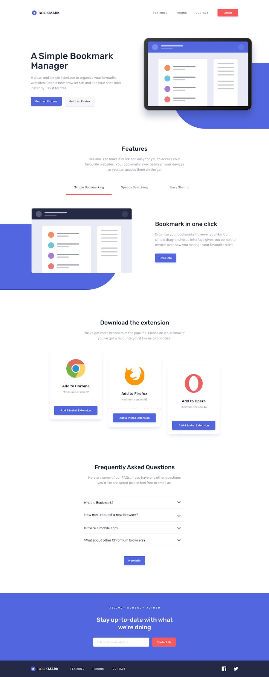
Sitio hecho con html y css y la validacion un poco de js y css
Design comparison
Solution retrospective
Feedback please
Community feedback
- P@dwhensonPosted over 3 years ago
Hey @mmc1999 nice work on this one. 🙌 I think you've got most of the tricky stuff sorted! Here's few points you might like to consider:
- You might want to think about stopping the page from spreading too wide a very large screens. There are many ways to do this but I set a grid on the body element, with three columns, as using a class selector as follows:
.center-content {
	display: grid;
	grid-template-columns: minmax(1rem, 1fr) minmax(375px, 1440px)minmax(1rem, 1fr);
}

.center-content > *  {
	grid-column: 2;
}
The 1440px is the max-width you want the main content to be, and the 1rem values is the smallest spacing you want either side of the main content on small screens (I sometimes put this to 0 and use a container to add padding to each section).
The second part positions all direct children of the body in this nicely sized middle column. In my case, mostly, my header, main, and footer the middle column, and stops them going wider than 1440px. It’s also pretty easy to ‘break’ elements out of this constraint if you need to.
- Regarding the FAQ section, one thing that really helped me with this one was the use of the details and summary HTML elements. These have much of the functionality baked in and can be styled with a little bit CSS work.
This also has the advantage of including keyboard functionality and allow the key elements to be focusable automatically, which is currently missing - and keyboard focus skips from the call to action buttons to the footer.
If you went with this approach you can also animate the opening and closing pretty simply using some code like:
details[open] summary ~ * {
	animation: sweep 0.2s ease-out;
	will-change: opacity, transform;
}

@keyframes sweep {
	0% {
		opacity: 0;
		transform: translateY(-1em);
	}

	100% {
		opacity: 1;
		transform: translateY(0);
	}
}
The styling of these elements can seem a bit complicated at first, but there are some good resources out there. The page is a bit of a mess but I have found the following page to be a pretty good guide in how to style things, including the triangle indicator: https://webdesign.tutsplus.com/tutorials/explaining-the-details-and-summary-elements--cms-21999
Hope this helps a little 👍
Cheers 👋
Dave
0
Please log in to post a comment
Log in with GitHubJoin our Discord community
Join thousands of Frontend Mentor community members taking the challenges, sharing resources, helping each other, and chatting about all things front-end!
Join our Discord
