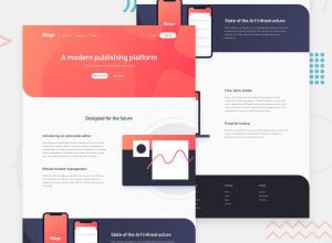
Design comparison
SolutionDesign
Solution retrospective
Any feedback is appreciated!
Community feedback
- Account deleted
Looks good expect that you need to put the container of the image on the right of the page to
overflow : hiddenso it does not have a huge empty unnecessary space on the other sections, or a horizontal scroll.And on the expandable menus I think it seems a little bit weird that when I click on a tab it only dismisses an open tab, if there is and then you have to click again to open it. One click should do both at the same time.
Keep coding👍.
Marked as helpful1@DanielM0802Posted over 3 years ago@thulanigamtee Thank you! I will correct these problems
0
Please log in to post a comment
Log in with GitHubJoin our Discord community
Join thousands of Frontend Mentor community members taking the challenges, sharing resources, helping each other, and chatting about all things front-end!
Join our Discord
