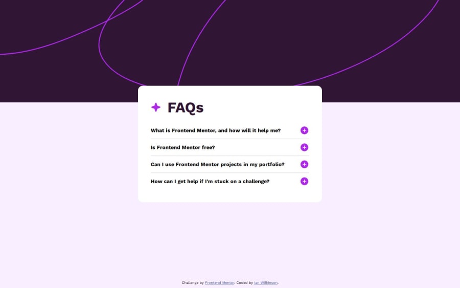
Design comparison
Solution retrospective
When I completed this project, I was most proud of learning how to use media queries to make sites responsive. What I would do differently next time is make the site for mobile first then adjust styles and create media queries as needed for non-mobile devices.
What challenges did you encounter, and how did you overcome them?Previously I set the attribution's position: absolute with bottom: 10px. I was having trouble getting the attribution to stay at the very bottom of the page when viewing the page on different devices. When selecting a question to expand the answer, the card would, at times, cause the page to increase in size and show a scroll bar. But, the attribution would remain where it was before the page increased in size, rather than stay at the absolute bottom of the page.
As a better alternative, I set the attribution's position: fixed so it will always be at the bottom of the page, even when the page increased in size.
I look forward to any feedback that would help me improve as a developer.
Community feedback
Please log in to post a comment
Log in with GitHubJoin our Discord community
Join thousands of Frontend Mentor community members taking the challenges, sharing resources, helping each other, and chatting about all things front-end!
Join our Discord
