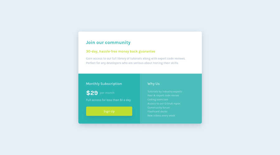
Design comparison
Solution retrospective
I thought it would be easier :D. Had trouble making it responsive, but at last, it worked. I would really appreciate feedback on this one. Thanks guys
Community feedback
- @shashreesamuelPosted almost 3 years ago
Good job completing this challenge.
Keep up the good work
Your solution looks great however I think that the content colored white in the card needs more opacity likewise the button using
opacity.Marked as helpful1 - @Hanka8Posted almost 3 years ago
Hi Maca, nice job!
I like your precise design. There is just one little thing i found in your code:
• When defining heights and widths of the containers, its better to use relative units than px. Thats because when the user changes the font size in his browser, cards containing the text should grow with it to prevent overflow. All font-sizes should be also defined by relative units, because when you use pixels, its not possible to change the font size in browser. On the other side, paddings should be defined by px, because you dont want them to grow with the text. You can try changing the font size in the browser to see what it does to your layout. I suggest reading this article about units. You can also consider using rems instead of px in your media.
• I noticed tha you are using ´display: flex´ together with ´width´. That can sometimes cause some confusions, consider using ´flex-basis´ instead. You can read about it here
Keep up the good work ☺
Marked as helpful1
Please log in to post a comment
Log in with GitHubJoin our Discord community
Join thousands of Frontend Mentor community members taking the challenges, sharing resources, helping each other, and chatting about all things front-end!
Join our Discord
