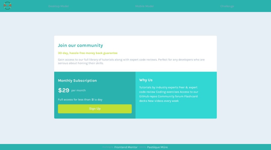
Design comparison
SolutionDesign
Solution retrospective
I have created a web page hosted on Netlify that automatically updates with screens for Frontend Mentor challenges, which you can find here: https://frontend-challenge-pastequemure.netlify.app/
For this challenge, I don't believe I've optimized it to the fullest. I'm facing an issue with the height of the cards on larger screens (not mobile). If someone could explain it to me, that would be really kind.
Of course, any constructive feedback is welcome! 😄
Community feedback
Please log in to post a comment
Log in with GitHubJoin our Discord community
Join thousands of Frontend Mentor community members taking the challenges, sharing resources, helping each other, and chatting about all things front-end!
Join our Discord
