Design comparison
SolutionDesign
Solution retrospective
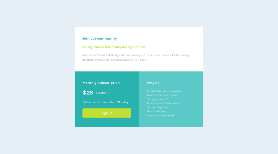
Really wanted to learn how to use grid: I have been struggling for a while but this project made me learn more! I think it turned out great, I have yet much to learn!
Kind regards, Peter
Community feedback
Please log in to post a comment
Log in with GitHubJoin our Discord community
Join thousands of Frontend Mentor community members taking the challenges, sharing resources, helping each other, and chatting about all things front-end!
Join our Discord
