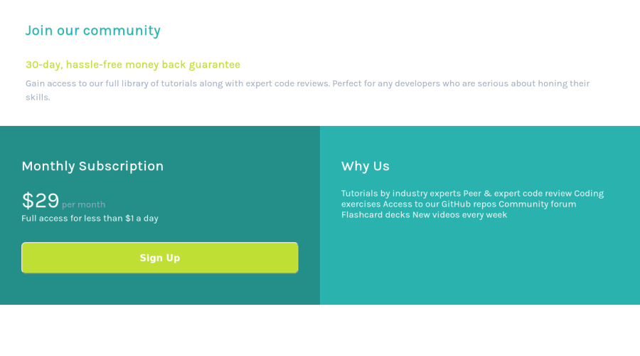
Design comparison
Solution retrospective
Any feedback is deeply appreciated.
Community feedback
- @laianbraumPosted almost 4 years ago
I agree with phonzdev, you should definitely use
<ul>for more semantic meaning, but you could also use just<br>in this one.Also, I noticed that the "Sign Up" button still has the inherit border of browser, to avoid that, use
border: none. The button appearance will be definitely way better. Nice solution.0@MojtabaMosaviPosted almost 4 years ago@laianbraum I truely appreciate the feedback, thank you.
0 - @phonzdevPosted almost 4 years ago
Hi @MojtabaMosavi, love the responsiveness on this one!
Here are a few things I'd recommend reviewing after taking a look at your code:
-use wrapper to contain the whole three boxes and set a
max-widthon it so it doesn't expand to the whole width of the browser-on the "Why Us" section, I'd recommend using the
<ul>tag to make it more meaningful :)Keep up the good work! Cheers!
0
Please log in to post a comment
Log in with GitHubJoin our Discord community
Join thousands of Frontend Mentor community members taking the challenges, sharing resources, helping each other, and chatting about all things front-end!
Join our Discord
