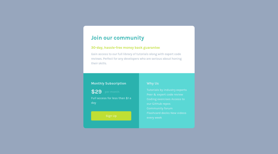
Design comparison
Solution retrospective
Feedback plz!!! NB: My css is messy. Was tired working on this. Just wanted to hit my daily goals.
Community feedback
- @riverCodesPosted over 2 years ago
Hi, I would suggest you to try doing this challenge with CSS Grid (it has grid in the title xD) This solution is fine too, and I used to use flexbox for everything as well, but recently I've become somewhat of a Grid fanboy haha.
I recently did this challenge myself and using Grid with one media query to shift the layout was a really effective and efficient approach.
-
Because, assuming you implement a mobile-first workflow (375px), the 3 blocks are the same width (height depends on content) so its really easy to make it by using grid of 1column, setting a max-width and boom you're done. You can measure the rough width of the blocks in the reference design using Greenshot. Set a padding on the body, and the blocks will automatically resize on smaller screens because of the max-width. All you have left to do is style the content inside the blocks. That's easy.
-
For the desktop design, simply make a 2x2 grid. Use grid-column and grid-row properties to fit the 2nd and 3rd blocks in the bottom row slots. Double the max-width on your 1st block and use the same properties to make it span 2 columns of the first row. And you're done! :D
If you're unfamiliar with the grid properties, i was too, but I'd say it's totally worth the effort of reading up about it. MDN webdocs are what I used, but I'm sure you can find some videos as well!
Just today, i discovered another feature of CSS Grid called subgrid and my mind is blown. (it is only supported by firefox at the moment but it should be supported browser wide by late 2022)
Marked as helpful1@Kratos012Posted over 2 years ago@riverCodes Yeah, I was always using flexbox before. But now I'm trying to learn more about grid. I haven't touched my computer for almost a month now due to illness. I feel I have lost all the progress I was making. So, I got to start learning all over again. Anyways, I won't give up tho. But, I won't lie, it's really frustrating knowing I would have been far along now if I kept at it. Well, life always happens.
0@riverCodesPosted over 2 years ago@Kratos012 hope youre doing well now bro! Even i took like a 10 day vacation from coding and it stings a little but the only way forward is to continue learning!
0 -
- @MohamedAridahPosted over 2 years ago
Hello @Kratos012, you did very Good job for this challenge it's also Responsive so Well done👏👍.
however i have some notes for you:
-
Please Recheck your solution
background
colors and make it like the design. -
To insure
.heade
will take the full width you can use:
.header{ grid-column: 1/-1; }
your current way is totally right
-
you should use
<h1>
heading level once in the page. So instead of using<h1>
tag inside.subscribtion
div you can use<h3>
. because the main heading of this div is<h2>
and you should use heading levels by orders like: using<h1>
then<h2>
then<h3>
and so on. This is Useful for SEO -
For
p
element inside.whyus
div. Try useul
element (unordered list) will be much better and this is More Html Semantic
<ul> <li>Tutorials by industry experts </li> <li>Peer & expert code review </li> <li>Coding exercises</li> <li>Access to our GitHub repos</li> <li>Community forum </li> <li>Flashcard decks </li> <li>ew videos every week</li> </ul>
- Your CSS code is Good ,but your styles for
<h1>
,<h2>
,<p>
and<a>
are set Globally . I've just wanted to draw your attention to this
I hope this wasn't too long for you, hoping also it was useful😍.
Goodbye and have a nice day.
Keep coding🚀
Marked as helpful0@Kratos012Posted over 2 years ago@MohamedAridah Nah, not long at all. This is actually why I'm here and what I want. I want as much feedback as possible so that I can improve. Using ul tag makes sense. I didn't read through the text. I just saw text and my reflexes just wait straight of the p tag.
Hey, and about the CSS you mentioned some of my tags were globally set. I honestly thought that was a good thing. I thought if a tag is used all through the html, we globally style it, and set classes when we want to style a specific part.
Thanks a lot for the feedback. This is very helpful. Appreciate!
0@MohamedAridahPosted over 2 years ago@Kratos012 Using global styles is indeed a good thing and I encourage you to use it, this makes code shorter and easy to edit later. ,but for example
a{ display: block; background-color: hsl(71, 73%, 54%); text-decoration: none; padding: 0.75rem; border-radius: 0.3rem; margin-top: 2rem; text-align: center; color: hsl(204, 43%, 93%); }
this styles will make All yours links to be like this and that's a quite impossible. so As global rules for the
<a>
you can use :a{ text-decoration: none; }
for the other styles you can use it as a
class
to be added when you need it. like:.btn{ display: block; background-color: hsl(71, 73%, 54%); color: hsl(204, 43%, 93%); padding: 0.75rem; border-radius: 0.3rem; margin-top: 2rem; text-align: center; }
I hope I've reached you the idea well, also I'm glad this was useful for you🌹👍
Marked as helpful1 -
Please log in to post a comment
Log in with GitHubJoin our Discord community
Join thousands of Frontend Mentor community members taking the challenges, sharing resources, helping each other, and chatting about all things front-end!
Join our Discord