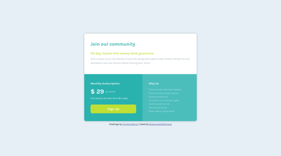
Design comparison
Solution retrospective
I found the challenge pretty easy and took about half an hour to finish, is this a good time ? The only thing I struggled with is to easily mimic the box-shadow and I didn't eventually, any thoughts to help ?
Would appreciate any feedbacks!
Community feedback
- @pikapikamartPosted almost 3 years ago
Hey, awesome work on another challenge. The desktop layout looks fine, it is just a bit smaller, for mobile state, right now it is too thin. If you go at 360px upwards, the site is thin/squished and it creates a horizontal scrollbar at the bottom.
To be honest, when doing challenges or just creating website/web app, I usually don't time myself because if I do, I might find myself bit rushing and not doing better approach or just making the site as great as I intended for it to be.
Here are some little suggestions for the site:
- For the
box-shadow
, I find this suites well0 16px 16px 2px rgba(0, 0, 0, .8)
Yeah, I usepx
when usingbox-shadow
, it is the only place I want to directly usepx
:>> - You can change those
section
tag into just usingdiv
since the heading for each part/section will already give structure on it. - For the first section, you can just use
p
tag on the text after theh1
since I think theh1
is enough on that part. - For the pricing, I would use a single
p
tag to wrap the plan pricing and the text on its right side:
<p> $ 29 <span> per month</span> </p>
This way, it will be read out as a single text. Though I would make the dollar sign as just
background
for thep
tag's::before
and I will add asr-only
span
with adollar
as text inside thep
tag and just after the29
text so that it will be read out as29 dollars per month
.- Lastly, just addressing the issue responsiveness, the mobile state and the horizontal scrollbar.
Aside from those, great job again on this one.
Marked as helpful2@MuhammadM1998Posted almost 3 years ago@pikapikamart Thanks for a great feedback once again, will be careful to to the points u marked in the following challenges. I use Page Ruler Redux to measure the dimensions of the card in the design image, what do you use that's working okay with you ?
0@pikapikamartPosted almost 3 years ago@MuhammadM1998 Hey, about the measurement, I just use adobe xd and just hunch for the sizing.
But for this one, have you tried going into mobile state like at 350px, issue arises in there since the layout is not rescaling well.
0@MuhammadM1998Posted almost 3 years ago@pikapikamart actually I test at 375px and above as stated in style guide
0@MuhammadM1998Posted almost 3 years ago@pikapikamart I didn't fully understood the adobe xd and hunch part. If XD is giving you the correct dimensions what do you use your hunch for, or what do you use XD for?
0@pikapikamartPosted almost 3 years ago@MuhammadM1998 I mean, on 375, the layout is somewhat thin because the
.wrapper
is only usingwidth: 40%
and not enough since there are huge spaces on each side of it.0@MuhammadM1998Posted almost 3 years ago@pikapikamart Got it I'll use a bigger width from now on. Thanks a lot!
0 - For the
Please log in to post a comment
Log in with GitHubJoin our Discord community
Join thousands of Frontend Mentor community members taking the challenges, sharing resources, helping each other, and chatting about all things front-end!
Join our Discord