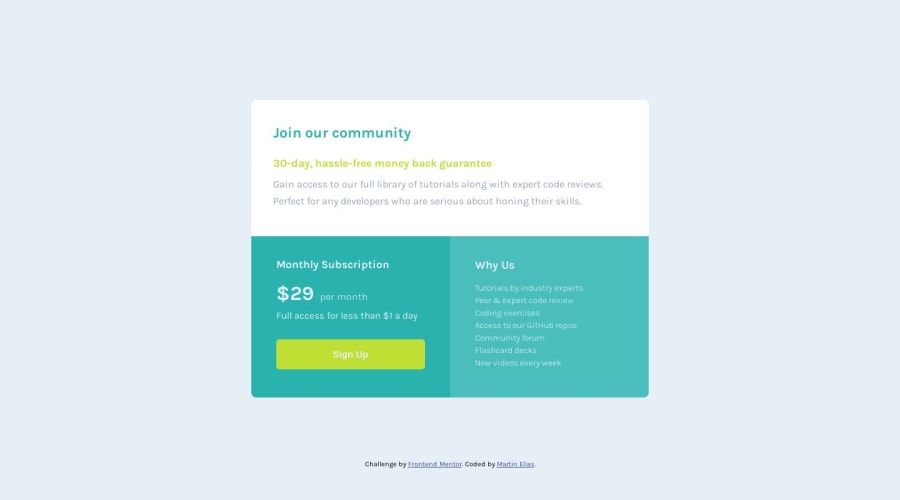
Design comparison
Solution retrospective
Feedback welcome. Thanks for taking the time.
Community feedback
- @Kamlesh0007Posted over 1 year ago
Congratulations on completing the challengeπ! That's a great achievement, and I'm sure you put a lot of effort into it. I really liked the way you approached the challenge and the code you wrote. You demonstrated a good understanding of the concepts and applied them effectively to solve the problem.I have a few suggestions to improve your code further. you can add the cursor:pointer to a button element to change the cursor to a pointer when hovering over the button. This is important to provide visual feedback to users and indicate that the button is clickable or interactive.
button:hover { cursor:pointer; }
Marked as helpful1@GHNetCodePosted over 1 year ago@Martin-00789 Hi Martin Your page is looking great! To further improve in addition to the previous advice provided regards the hover state this will be for desktop. For touchscreens like mobiles and tablets etc.. you can look at the buttons "active" state when the button is actually being pressed down so it can work with touchscreens as well.. Have a look at this codepen as an example where it does have some JS but that's not really needed for the visuals handled by CSS. ( https://codepen.io/nicm42/pen/zYdYKJN )
Hope this helps!
Cheers, //M.
Marked as helpful0 - @0xabdulkhaliqPosted over 1 year ago
Hello there π. Congratulations on successfully completing the challenge! π
- I have other recommendations regarding your code that I believe will be of great interest to you.
HEADINGS β οΈ:
- This solution lacks usage of
<h1>
so it can cause severe accessibility errors due to lack of level-one headings<h1>
- Every site must want only one
h1
element identifying and describing the main content of the page.
- An
h1
heading provides an important navigation point for users of assistive technologies, allowing them to easily find the main content of the page.
- So we want to add a level-one heading to improve accessibility by reading aloud the heading by screen readers, you can achieve this by adding a
sr-only
class to hide it from visual users (it will be useful for visually impaired users)
- Example:
<h1 class="sr-only">Single price grid component</h1>
- If you have any questions or need further clarification, you can always check out
my submission
for this challenge where i used this technique and feel free to reach out to me.
.
I hope you find this helpful π Above all, the solution you submitted is great !
Happy coding!
Marked as helpful0
Please log in to post a comment
Log in with GitHubJoin our Discord community
Join thousands of Frontend Mentor community members taking the challenges, sharing resources, helping each other, and chatting about all things front-end!
Join our Discord