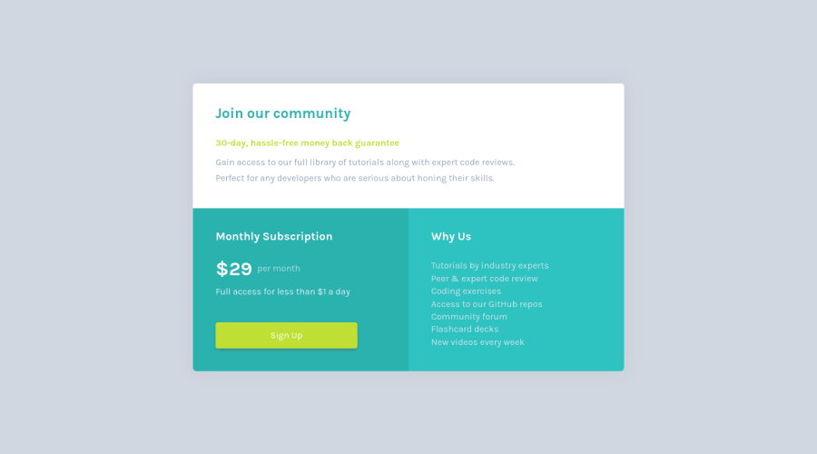
Not Found
Not Found
Not Found
Not Found
Not Found
Not Found
Not Found
Not Found
Not Found
Not Found
Not Found
Not Found
Not Found
Not Found
Not Found
Not Found
Not Found
Not Found
Not Found
Not Found

Submitted

Single-price-grid-component by using Flex-box .

PeaNuโ€ข 90

@jubeatt

Desktop design screenshot for the Single price grid component coding challenge

This is a solution for...

  • HTML
  • CSS
1newbie
View challenge

Design comparison


SolutionDesign

Solution retrospective


I have written all my process of this challenge in README.md. so you can check it on my Github. If you have any better way for this challenge or you found any wrong with it. Please give me some feedback here or send an email to me!

Thank you, guys!

Community feedback

Antonโ€ข 515

@antarya

Posted

Looks cool. Nice job.

I have a couple of suggestions, though:

  1. On the desktop, if you keep decreasing height, you will notice that because of overflow: hidden on section tag or height: 100vh; on body tag part of the section will be hidden and not scrollable. The solution depends on what you want to achieve. One of the solutions would be to change overflow: hidden; to overflow: auto; on section tag. So section tag will have a scrollbar. Otherwise, it would be best to restructure it slightly so the body is scrollable and the section tag is fully visible.

  2. There are minor differences when compared to the original design. It looks excellent as it is, but if the designer sees it, they might be mad :). I will list them in case you do not notice.

  • The overall spacing between different strings do not match the one that is in design. Try to use a slider, and you will see the difference.

  • Second sentence of the "Gain access ..." paragraph is on the next line which might mean either designer wanted the second paragraph to be on the second line or paragraph width is limited using max-width.

  • From design second and third section header is bold.

  • The button text when hovered is hard to read; maybe making it darker instead of lighter will look better. (e.g. Material-UI Button )

  • There are a couple of accessibility issues that I think can be easily fixed. Wrap your content into the main tag. Use the h1 tag for the first header.

  1. In toolkits like Bootstrap, the class name .row is used to wrap columns, so it is a little bit more abstract name. I guess renaming or using BEM (e.g. price-grid__row, price-grid__join, price-grid__subscription) will help to be more specific and will help in case other toolkits will overwrite it. One trick I use to find a proper name for class is to use https://www.thesaurus.com/ and find synonyms that better match.

  2. It might be easier to define box-sizing in the reset file for all possible elements. You can check the example here CSS-Tricks box-sizing.

By the way, the structure and details of the Readme file are amazing.

Browser Version: 92.0.4515.107 (Official Build) (64-bit) OS: Ubuntu 20.04

I am new to this platform; if I missed or misunderstood something, I will appreciate the feedback.

Marked as helpful

2

PeaNuโ€ข 90

@jubeatt

Posted

@antarya

Hi, Antom.

Thanks for the amazing reply and suggestion.๐Ÿ˜Ž

I have updated the new version on my GitHub. If you are interested, you can check it on my GitHub.

(By the way, It's so sorry for taking so much time to give you a reply. Actually, I have read your message early, But I spent some time searching for information at your suggestion, plus, My English isn't actually that good, so it's also taking a lot of time to write this message, and that's why it takes so long... I hope you don't mind.๐Ÿ˜ญ)

About overflow issue on the desktop version

Indeed, if you didn't mention this issue, I think I would never notice that.๐Ÿคฃ

  • The first solution:

    As you said. when I set overflow: hidden to overflow: auto. the issue was solved.

    The reason why I set overflow: hidden is I want to create a border-radius effect at the first (I always do that since I know this trick, but I don't notice that problem before.)

    I know the principle is base on "hiding the overflowing content from the container", so it's intuitive to set overflow: hidden instead of overflow: auto.

    So I searched for some info about overflow, I found it. "The default value of overflow is visible" , and if we try to make the effect that container can cover something that is overflow, we just need to set the value to anything except visible.

    That is interesting for me because I thought it can be only set to hidden before.

  • The second solution:

    If I don't misunderstand, you mean I can modify the structure of the HTML, to make the body can show the scroll, is it?

    If it does. I get it.

    But I also took a test, and I found there is an another solution that is to remove the following code from the body :

    @media screen and (min-width: 760px) {
      body {
        height: 100vh;
        display: flex;
        flex-direction: column;
        justify-content: center;
      }
    }
    

    (It was going to make the component can be set to center)

    Although there is no center effect anymore, the body can create the scroll now.

    However, I think both solutions are OK, it just depends on what do we want.

About the difference between result and design.

  • about the spacing problem:

    Did you mean like line-height or margin with the text? Because the design file is just a picture, and I didn't find any information about the spacing, so I just eyeball all of the spacing, and I know there should have differences compared to the design.๐Ÿ˜ญ

  • about the text wrap problem:

    Because I took "mobile-first" on this project at the beginning, and I saw there's no text wrap from the mobile version design, so I only used a <p> tag to create an HTML like this:

<p>
  Gain access to our full library of tutorials along with expert code reviews.
  Perfect for any developers who are serious about honing their skills.
</p>

So, if we want to fix this problem and we don't want to change its structure.

The only way we can do is by using max-width and strict its width, to make the second text create a new line on the desktop. is that correct?๐Ÿค”

  • The title degree of thickness problem: It has been updated.

  • hover state of the button: It has been updated.

  • accessibility issues: It has been updated.

  • About the class name problem:

    The reason why I name the class .row is that I started from mobile design at the beginning, and its layout is line by line, so it is intuitive to name it .row(so sadly)

    As you said, it may cause some conflict with bootstrap, so it's not a good idea to use that name actually.

    In addition, about BEM style, I took some time to read it information.

    I think I will try to use that on my next challenge.

    And when I get family with BEM, I want to retry this challenge in the future.

    However, thanks for the suggestion.

    By the way, the website you recommended is good as well.

  • About box-sizing:

    It's actually my habit. because I was spoiled by padding/border many times before. so it helps me to keep this pitfall in mind. (well, just a reminder๐Ÿ˜‚)

    I have seen the article that you posted, there is something I am impressed that when you consider responsive design, the "relative unit" (like % or em, etc.) would make it very very complex. So, I think I should change my habit since I know how it works.

    By the way, I think something is interesting that is how you put box-sizing in your reset.css.

In the end, I really appreciate the reply, and I try to make this message as clear as I can, but I think it would still not be very clear at all.

If you have any questions on some parts of them, please let me know, so I can make an explanation for you.๐Ÿ˜Š

By the way it almost took me a day to write this.๐Ÿ˜“ (so sadly๐Ÿ˜‚)

But don't mind, I just want to write a best reply for you, because I think it is worth to do.๐Ÿ˜Ž

1
Antonโ€ข 515

@antarya

Posted

Hi Jim,

Thanks for your detailed follow-up.

I checked your updates, and it looks good.

  1. Regarding the overflow issue - I think it is still there. With the second approach, you can also achieve that it is centred. But again, it all depends on the end goal. I created a pull request with a centred version double check it.

  2. Regarding design differences:

  • spacing problem - I was talking about space between different text tags, e.g. first section with "Join our community" (1), "30-day..." (2) and "Gain access" (3); from the design, you can see that space between 1 and 2 is greater than 3, but in your case, it looks vice-versa.

  • The section with aย button in design has bottom and left padding space equal.

Again all of this is totally fine as it is, and it will be much easier having a real sketch file; only saying so you can see and train your eye.

  • Regarding text wrap, you are correct max-width would be the best option. But instead of percentage, I would use px/rem. Otherwise, when you change the browser width to a smaller but still desktop version, it looks very tight. The max-width of text/paragraphs most probably will be defined by designer/mockup, e.g. 760px.

Do not worry about time spent on answering or not responding immediately. There is no rush, and there was a lot to grasp. But if you feel uncomfortable (I also do :)), you can always respond with something like 'Thanks for your input, I would check and get back to you in a couple of days.'.

Your response is clear, so you should not worry about that too. I am also not a native speaker, so it also takes me some time to write, rewrite and format; one thing that helps me is Grammarly; it is like eslint and prettier but for English.

You are doing a great job. Cheers!

0
PeaNuโ€ข 90

@jubeatt

Posted

Hi Anton,

It's great to see your reply!

I have checked it, and the fork from GitHub too.

And I need some time to write the report.

But don't worry, It would not take too long.๐Ÿ˜‰

I will get back soon.

By the way, I'm working on my second challenge, so when I finished that, I definitely go back to fix the issues.

In the end, It's too many things want to say thanks to you. I really got a lot of help from you and learned so many things.

Cheers! and keep awesome!

0
PeaNuโ€ข 90

@jubeatt

Posted

Hi Anton, I have come back.๐ŸŽŠ

I've just finished my second challenge not long ago, so now I have time can give you this reply.๐Ÿ’ฆ

I've merged your pull request, also I re-optimized some things.

Regarding the update:

  • Move box-sizing to reset.css
  • Adjust the text space of section-1
  • Adjust the paddings of sections
  • Adjust max-width on the desktop version
  • Reset the elements of section-2
  • Reset box-shadow of the container

Regarding the overflow issue:

I saw the problem still there, and it will cut the view. I've checked the pull request you send, so I re-think that how to make it vertically centered, and now I've understood it.

I appreciate that you went out of your way to send the pull request for me.๐Ÿ˜Š

Regarding the spacing of the design:

I understand what you meaning๐Ÿ˜ฎ, it seems that I'm not careful with my eyes. I've fixed the problem.

I will do more train for my eyes, and be more observant.

Regarding the text wrap problem:

This part I get it. and you're right, the percentage actually would make some problem by changing the screen size, and thanks for your remind and suggestion again.

In the end, I appreciate that you didn't dislike me, instead, you gave me a lot of suggestions and encouragement.๐Ÿ˜Š

By the way, I use Grammarly to help me too, It's really a good tool.

0

Please log in to post a comment

Log in with GitHub
Discord logo

Join our Discord community

Join thousands of Frontend Mentor community members taking the challenges, sharing resources, helping each other, and chatting about all things front-end!

Join our Discord