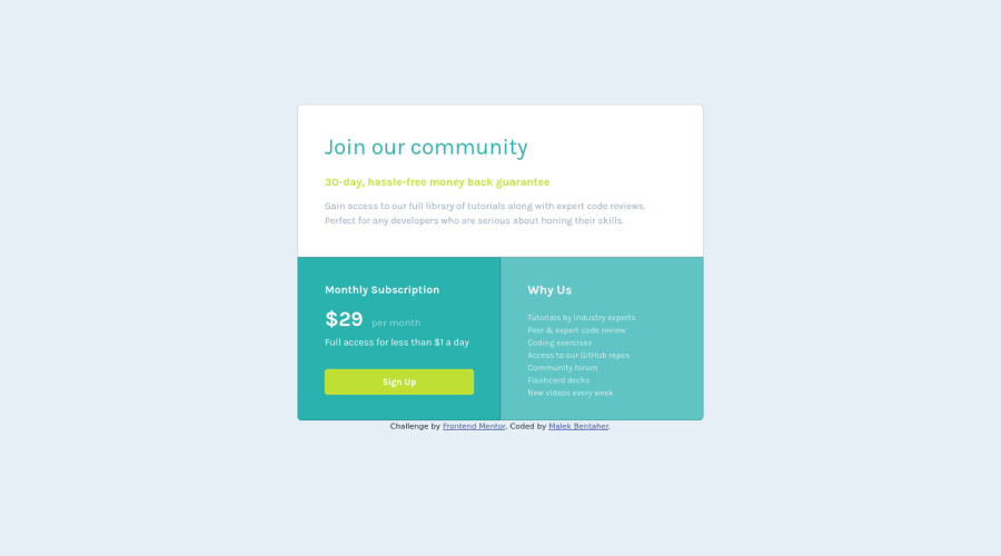
Design comparison
Community feedback
- @hatemhenchirPosted almost 2 years ago
Hey Bentaher Malek, how are you ? I really liked the result of your project, but I have some tips that I think you will enjoy:
1.You have used <br>. Using <br> is not only bad practice, it is problematic for people who navigate with the aid of screen reading technology. Screen readers may announce the presence of the element. This can be a confusing and frustrating experience for the person using the screen reader. You can read more in MDN
2.Consider using rem for font size. If your web content font sizes are set in absolute units, such as pixels, the user will not be able to re-size the text or control the font size based on their needs. Relative units “stretch” according to the screen size and/or user’s preferred font size, and work on a large range of devices.
3.If you are notice in this challenge we are used just one font-family. So you can just do font-family just in the body like this:
body{font-family: 'Karla', sans-serif;}The rest is great!
If you have any questions or need further clarification, feel free to reach out to me.
Happy Coding! 🍂🦃
Marked as helpful1
Please log in to post a comment
Log in with GitHubJoin our Discord community
Join thousands of Frontend Mentor community members taking the challenges, sharing resources, helping each other, and chatting about all things front-end!
Join our Discord
