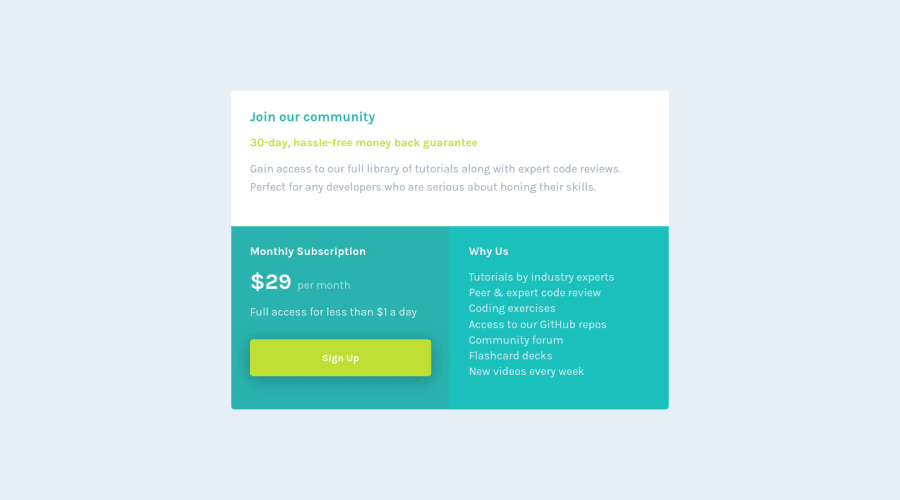


Design comparison
SolutionDesign

Solution retrospective
I'm new to grid so any suggestion is welcome
Community feedback
- @vanzasetiaPosted over 3 years ago
👋 Hi Julian!
👍 Good job on completing this challenge! Your website is looking good and responsive overall 🙌, so well done! I have some feedback on this solution:
- Accessibility
- The button doesn't have
:hoverstyle. Adding the:hoverstyling on the button will help the user notice that it is clickable. - Create a custom
:focus-visiblestyling to any interactive elements (button, links,input,textarea). This will make the users can navigate this website using keyboard (Tab) easily. - I would recommend using
ulandliinstead ofbrtag for the list on the Why Us section. I have used Narrator on your solution and it just read everything at once, which it shouldn't.
- The button doesn't have
- Visual
- I would recommend adding
paddingto thebodyelement to prevent the card touching the edge of the screen. Right now on my mobile view (360px * 640px), the card having full height.
- I would recommend adding
That's it! Hopefully, this is helpful!
Marked as helpful1@Julr09Posted over 3 years ago@vanzasetia Definitely will keep that in mind, thank you so much for taking your time and reviewing my solution.
0 - Accessibility

Please log in to post a comment
Log in with GitHubJoin our Discord community
Join thousands of Frontend Mentor community members taking the challenges, sharing resources, helping each other, and chatting about all things front-end!
Join our Discord