Not Found
Not Found
Not Found
Not Found
Not Found
Not Found
Not Found
Not Found
Not Found
Not Found
Not Found
Not Found
Not Found
Not Found
Not Found
Not Found
Not Found
Not Found
Not Found
Not Found

Submitted

singlepricecompnenet

@MouayyadAhmed

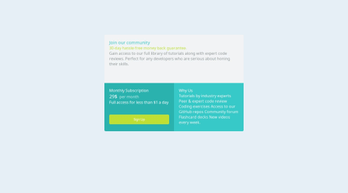
Desktop design screenshot for the Single price grid component coding challenge

This is a solution for...

  • HTML
  • CSS
1newbie
View challenge

Design comparison


SolutionDesign

Solution retrospective


What are you most proud of, and what would you do differently next time?

Proud to make this page in early step .

What challenges did you encounter, and how did you overcome them?

How to divide the page ,How to customize it .

Community feedback

geomydas 1,060

@geomydas

Posted

Hi @MouayyadAdhmed, I have recently just finished reading your code, it looks good to me but it has some few issues regarding it

My Feedback and Suggestions

  1. Self host google fonts. Using @import and directly linking to their api is much slower and is not privacy friendly which may get you into lawsuits regarding GDPR. I use this handy tool to help me self host my fonts
  2. Use a CSS reset. What a css reset does is that it makes your css look the same across browsers and devices. you dont have to do anything that much since you only need to copy and paste it inside your css and you are all set. i reccomend using josh comeau or andy bell css reset
  3. Replace the article element with a main element. an article element is typically used for sections such as news blog, prose and etc. you also need to have atleast 1 main landmark in your website
  4. Replace the article element with a main element. an article element is typically used for sections such as news blog, prose and etc. you also need to have atleast 1 main landmark in your website
  5. take a look at the bem naming convention for naming your classes inside the html and writing more maintanable css. its quite verbose but i promise you it is the best thing i have learnt in css
  6. remove all paddings on the article selector in your css. i dont reccomend using that technique to center something using css, you can use this code snippet in other projects where it is just one component such as this project, blog card, qr code card componet
body {
    display: grid;
    place-items: center;
    min-height: 100vh
}
  1. Never ever set fixed heights. there isnt really a need to so since the paddings, margins, text content of the child element will likely take that height already. also setting fixed heights makes it unresponsive and it may likely cause overflow issues. if you really need to set a height, use the min-height property in css. you would only set fixed heights on something that is small and not likely to shrink such as a profile picture avatar
  2. dont comment in another language. comment your code in english instead, other developers will not know your language either and english is the most likely language that they will know
  3. use the rem unit in place of px most of the time. you would typicall use px for very small stuff such as border, outline and shadows. you would really use rem for the others. to be more specific, you would use rem if you want to scale with the users set font size for accesibility which is likely the case most of the time
  4. never ever set font sizes in rem. this is inaccesible see why
  5. set a font-family in the body if there is only one font as it cascades therefore all elements will also receive that font size instead of making a css variable and using it inside a font family property on every selector
  6. remove justify-content: center on your article selector as that does nothing at all
  7. use a code formatter such as prettier to automatically format your code therefore making it more readable
  8. dont use words for setting font size, use the rem or em unit instead. using words such as font-size:large will make it hard to decipher on how really big "large" is
  9. make the paragraph with the class of tutorials insdie your html a ul tag instead of a paragraph and nest each line inside a li tag
  10. dont use paragraphs for everything. for example, you should replace the paragraph with the class of join inside your html with an h1 tag. its easy to decide when to choose headings vs paragraphs as headings typically have larger font size, thicker font weight, and shorter text content

don't be overwhelmed with all of this and treat it as a check list and do things one at a time. dont forget to commit your changes on github after updating your code for more feedback. have a nice day and have fun coding!

Marked as helpful

1

Please log in to post a comment

Log in with GitHub
Discord logo

Join our Discord community

Join thousands of Frontend Mentor community members taking the challenges, sharing resources, helping each other, and chatting about all things front-end!

Join our Discord