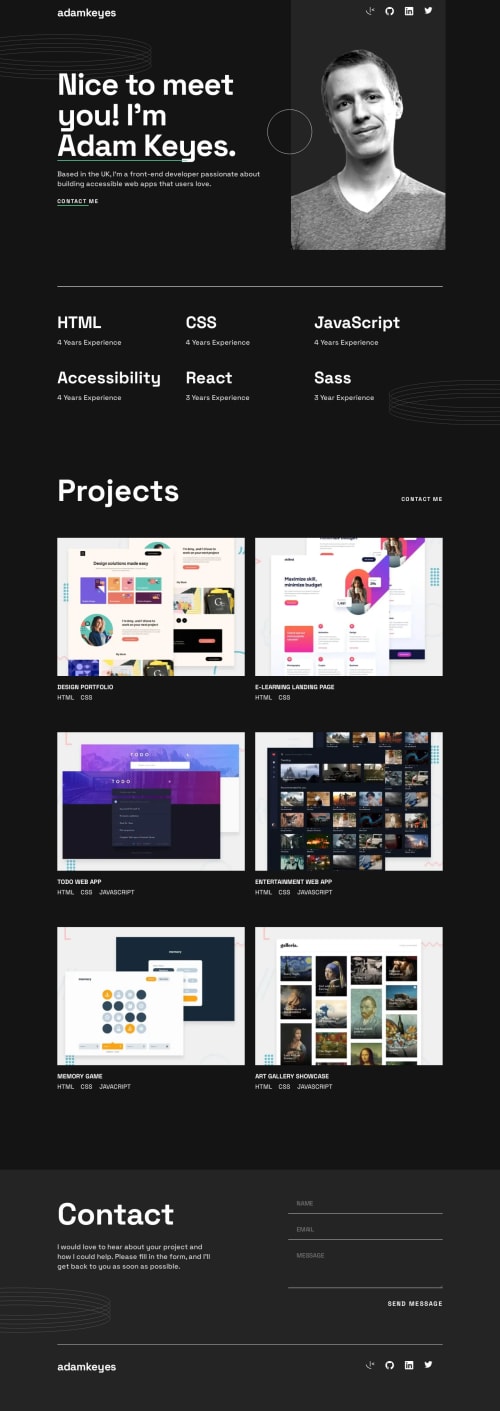
Single-Page-Developer-Portfolio

Solution retrospective
Hello everyone!
I'm excited to share my latest portfolio challenge with you and have a few questions:
Responsive Design with Clamp:
When using the clamp function for responsive design across mobile, tablet, and desktop versions, should I set the width of the element from mobile to desktop, or from mobile to tablet, and then from tablet to desktop? I've noticed some alignment issues, and I'm curious about the best approach.
Custom Scroll Effects:
I decided to change the underlining of elements to occur when scrolling over them rather than having a stock underline appear when reaching the elements. Is this type of creative freedom encouraged in web design, or is it generally recommended to stick as closely as possible to the original design?
Pixel Perfection Issues:
I tried using pixel-perfect techniques to ensure my webpage matches the design as closely as possible. However, when I uploaded a design image, it appeared slightly larger than the Figma file. Has anyone experienced similar issues, and are there alternative tools or methods for achieving pixel perfection?
Path Changes in Grid Container:
While transitioning between tablet and desktop views, and vice versa, I've noticed some unexpected changes in the paths that projects take within their grid container. Can someone provide insight into what might be happening here? It seems a bit peculiar to me.
Feel free to check out my portfolio and share your feedback.
Thank you,
Gerardo Garcia
Please log in to post a comment
Log in with GitHubCommunity feedback
No feedback yet. Be the first to give feedback on Gerardo Garcia's solution.
Join our Discord community
Join thousands of Frontend Mentor community members taking the challenges, sharing resources, helping each other, and chatting about all things front-end!
Join our Discord