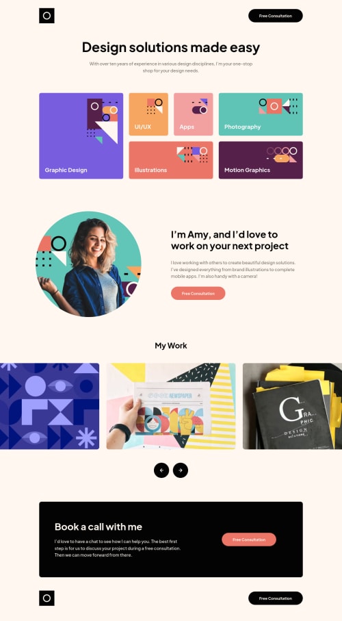
Single-page portfolio made using Sass + Swiper

Solution retrospective
Hey everyone,
This was my first Pro challenge, and I loved it! Having the design file was great for matching the styles precisely. I used Sass for this project, and continued learning the CUBE CSS design system. My goal was to use make reusable utility classes wherever possible. When I got to the spacing between different sections, I wasn't quite sure how to handle the inconsistencies across screen sizes, so there's still a lot of hard-coded styles. I'll have to revisit this project when I've figured out a way to make my CSS more dry.
Also, I tried a new JS library called Swiper. I was able to quickly setup a carousel and configure it exactly how I wanted. I'll definitely be using it in future projects.
Would love any feedback you have, thanks! 😊
Please log in to post a comment
Log in with GitHubCommunity feedback
No feedback yet. Be the first to give feedback on Curtis Simpson's solution.
Join our Discord community
Join thousands of Frontend Mentor community members taking the challenges, sharing resources, helping each other, and chatting about all things front-end!
Join our Discord