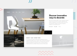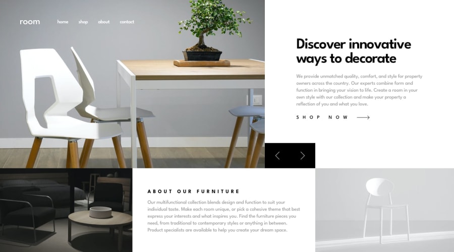
Design comparison
Solution retrospective
I feel I kinda accomplished the task, but maybe I need to work on writing clean code? This is the first time I've accomplished something this complex(atleast to me), would love to hear feedback on how can I improve.
Community feedback
- @A-amonPosted over 3 years ago
Hello! It looks good, so is the responsiveness.
I have a few suggestions:
-
Use tags like header, main and footer. E.g. main tag for the main content.
-
Use button tags for the slider control. Using the appropriate tags is important for screen reader users. :)
-
You can try using media queries in CSS or picture tag in HTML for switching between the hero images.
-
Have a separate JS file for JS code.
-
You can try using after selector for the Shop Now button's arrow. But your current one is good too!
1 -
Please log in to post a comment
Log in with GitHubJoin our Discord community
Join thousands of Frontend Mentor community members taking the challenges, sharing resources, helping each other, and chatting about all things front-end!
Join our Discord
