Submitted almost 2 years ago
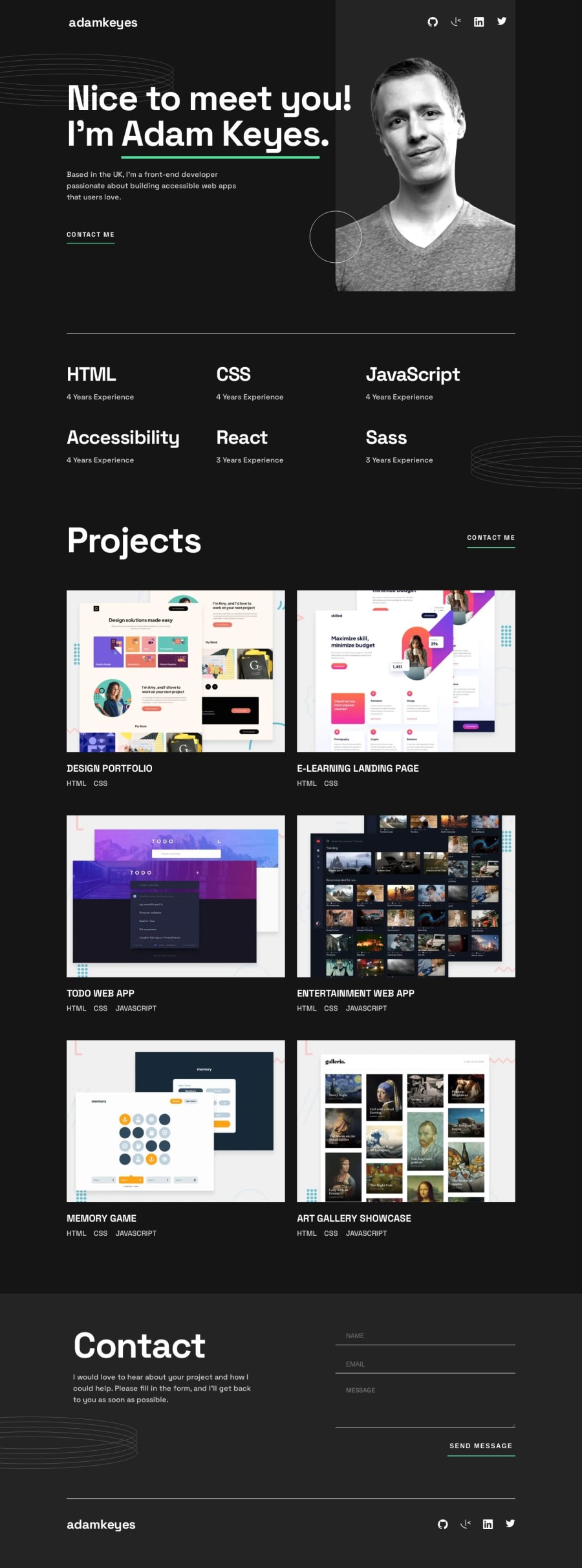
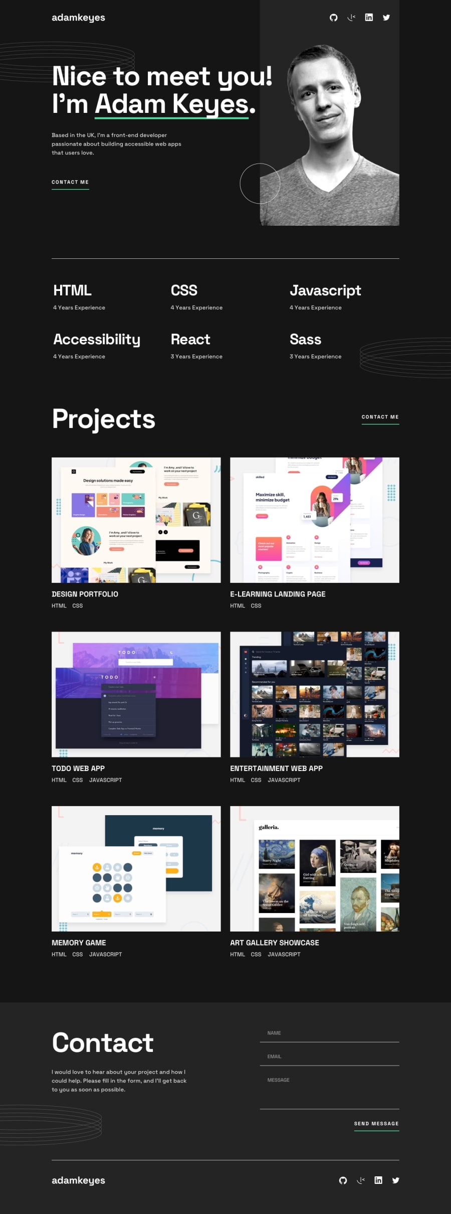
Single-page developer portfolio with form validation
P
@Stacy-Riley
Design comparison
SolutionDesign
Solution retrospective
Hi Frontend Community,
I found the decorative elements to be a bit more difficult than I initially imagined they would be. Thankfully I am understanding them better now and looking forward to using them in new projects to give the pages some more visual interest.
It was a great project and I'm looking forward to the next one!
Community feedback
Please log in to post a comment
Log in with GitHubJoin our Discord community
Join thousands of Frontend Mentor community members taking the challenges, sharing resources, helping each other, and chatting about all things front-end!
Join our Discord
