Design comparison
SolutionDesign
Solution retrospective
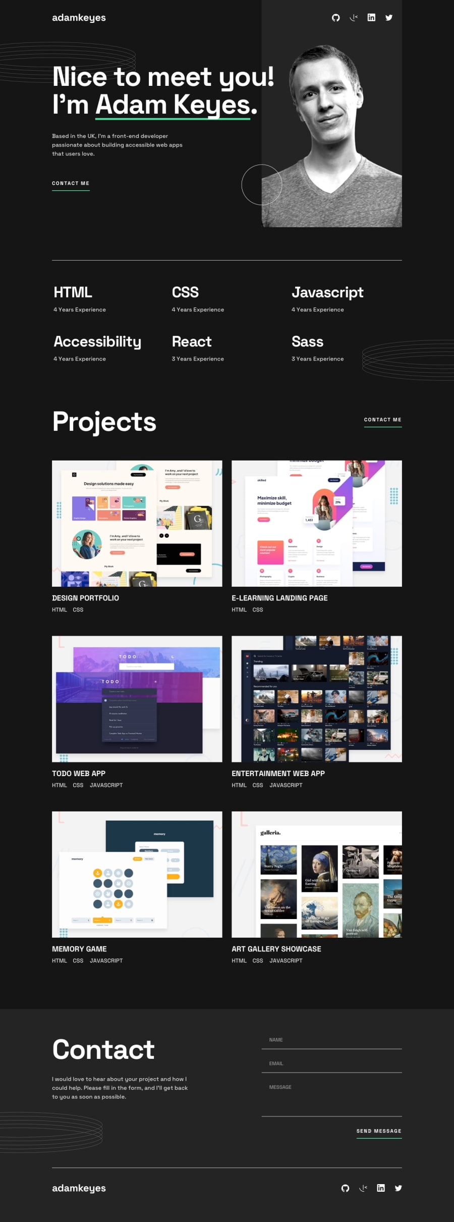
For this challenge, I used just HTML and CSS. The most challenging piece BY FAR were the overlaid rings/circle background images. I spent so much time figuring out how to prevent horizontal scrolling after adding the two images on the right.
My main question - is there a better way to go about placing these background images? I used px with absolute positioning, so I'm not sure how much of an issue this is in terms of responsiveness. I also couldn't figure out how to properly place the rings image (in the skills section) when on desktop.
Any and all feedback welcome - thank you!
Community feedback
Please log in to post a comment
Log in with GitHubJoin our Discord community
Join thousands of Frontend Mentor community members taking the challenges, sharing resources, helping each other, and chatting about all things front-end!
Join our Discord
