Submitted about 2 years ago
React Portfolio Build
#accessibility#react#sass/scss#vite
@satrop
Design comparison
SolutionDesign
Solution retrospective
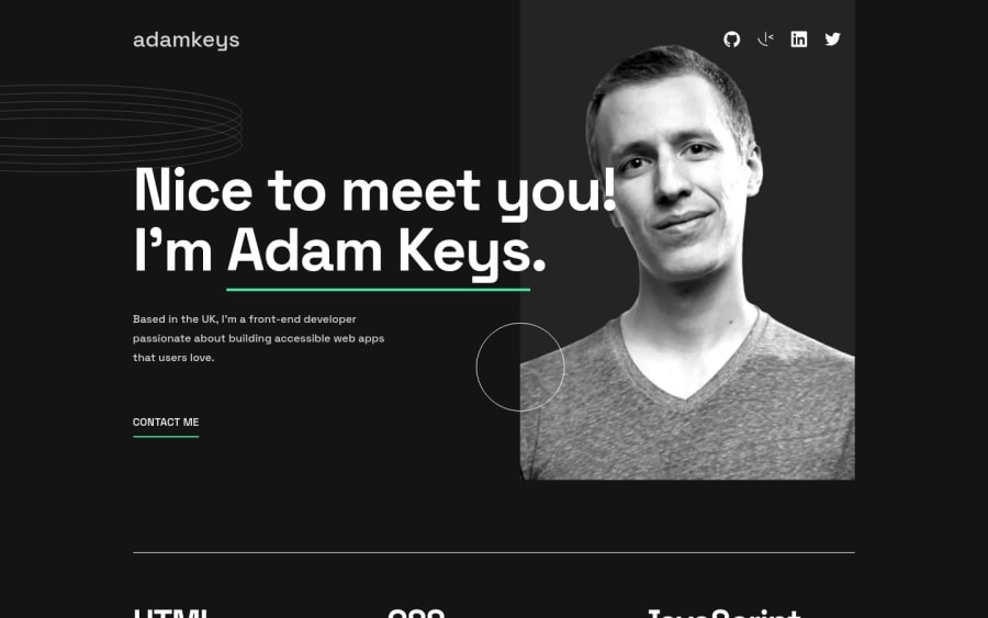
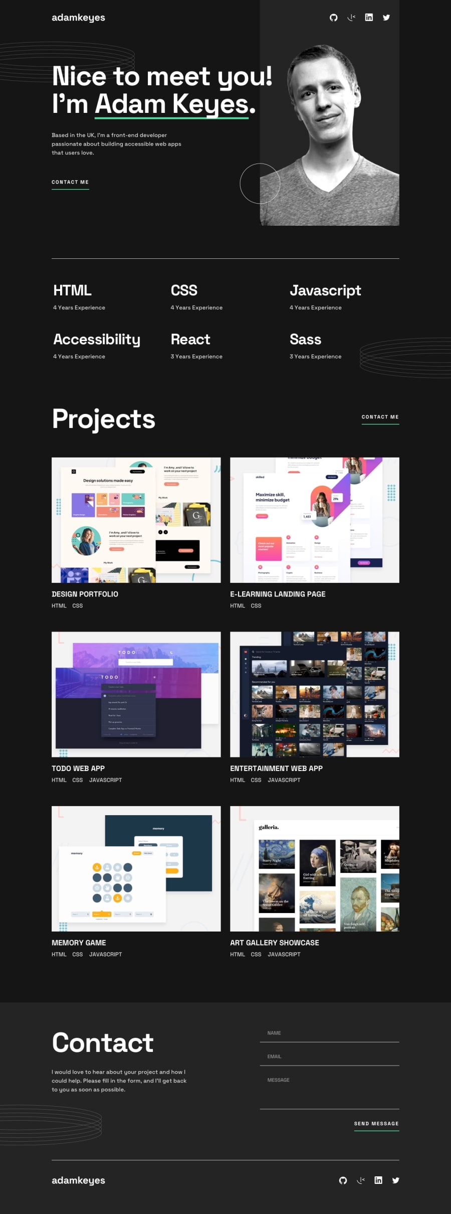
- Took the raw HTML that came with the project and re-factored the HTML into data for the projects list. It might be slightly over-engendering for data this small but I did it to brush up on creating a data file and mapping over a nested array.
- Concentrated on keyboard controls to make sure all tabbable elements were reachable.
- Added a unique focus style, one that differs from the hover effect for a better ADA UI.
- Dropped in some subtle animation on the rings just for a little eye candy.
- Used React Hook Form for a simple way to do form validation.
Have a poke around, and let me know what you think, what I can improve, and what I missed.
All the best, Steve
Community feedback
Please log in to post a comment
Log in with GitHubJoin our Discord community
Join thousands of Frontend Mentor community members taking the challenges, sharing resources, helping each other, and chatting about all things front-end!
Join our Discord
