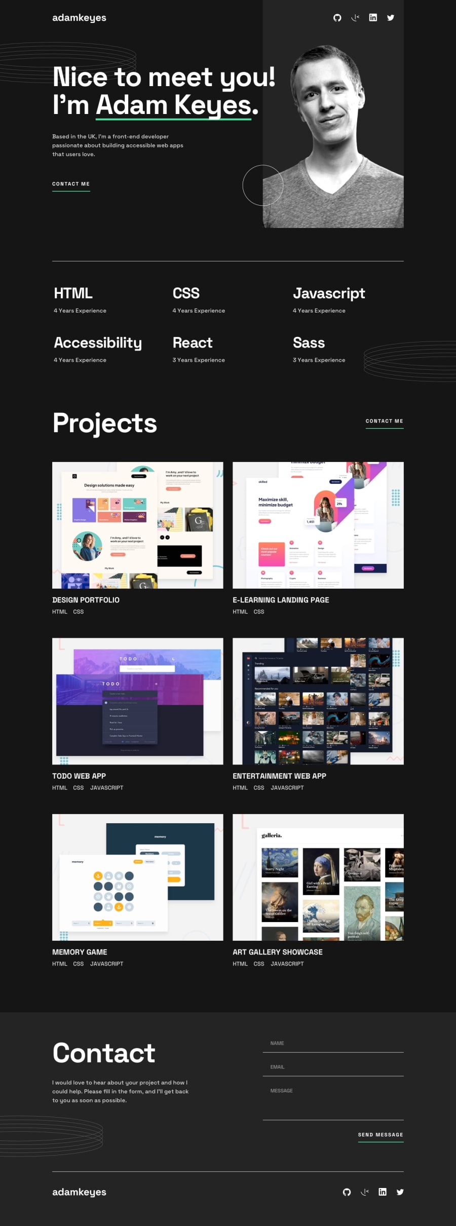
Design comparison
Solution retrospective
I had a few problems with the hero section, aligning the social nav and intro text with the picture. My picture is positioned absolute on the tablet and desktop versions of the page. I was struggling to decide how to architect the top nav bar (adamkeyes & social icons) in relation to the portrait image.
Community feedback
- @nelsonleonePosted almost 2 years ago
HELLO .....congrats on completing this challenge, it's nice 🎉🎉🎉
I have little tip on how you can position the nav icons, hope this comment was helpful and made meaning to you
You can use position relative on the image container.
The container, should bear the image and the icons .
Then set a position of absolute on the icons , you can easily position them as you like since the will be contained by there relative position parent container.
Set a z-index on them to make them always appear on top.
This is one way to do it ,
You can make the name-logo, and icons to be your nav, on the top of your page.
Then your intro should have a display flex, give the image container a specific width so it doesn't go away when you absolutely position the image, you can then position the image to be behind the icons, setting a z-index so it goes behind them
Have fun coding🎉
0
Please log in to post a comment
Log in with GitHubJoin our Discord community
Join thousands of Frontend Mentor community members taking the challenges, sharing resources, helping each other, and chatting about all things front-end!
Join our Discord
