Design comparison
Solution retrospective
Hello everyone hope that all of you are having a great time with all the challenges.
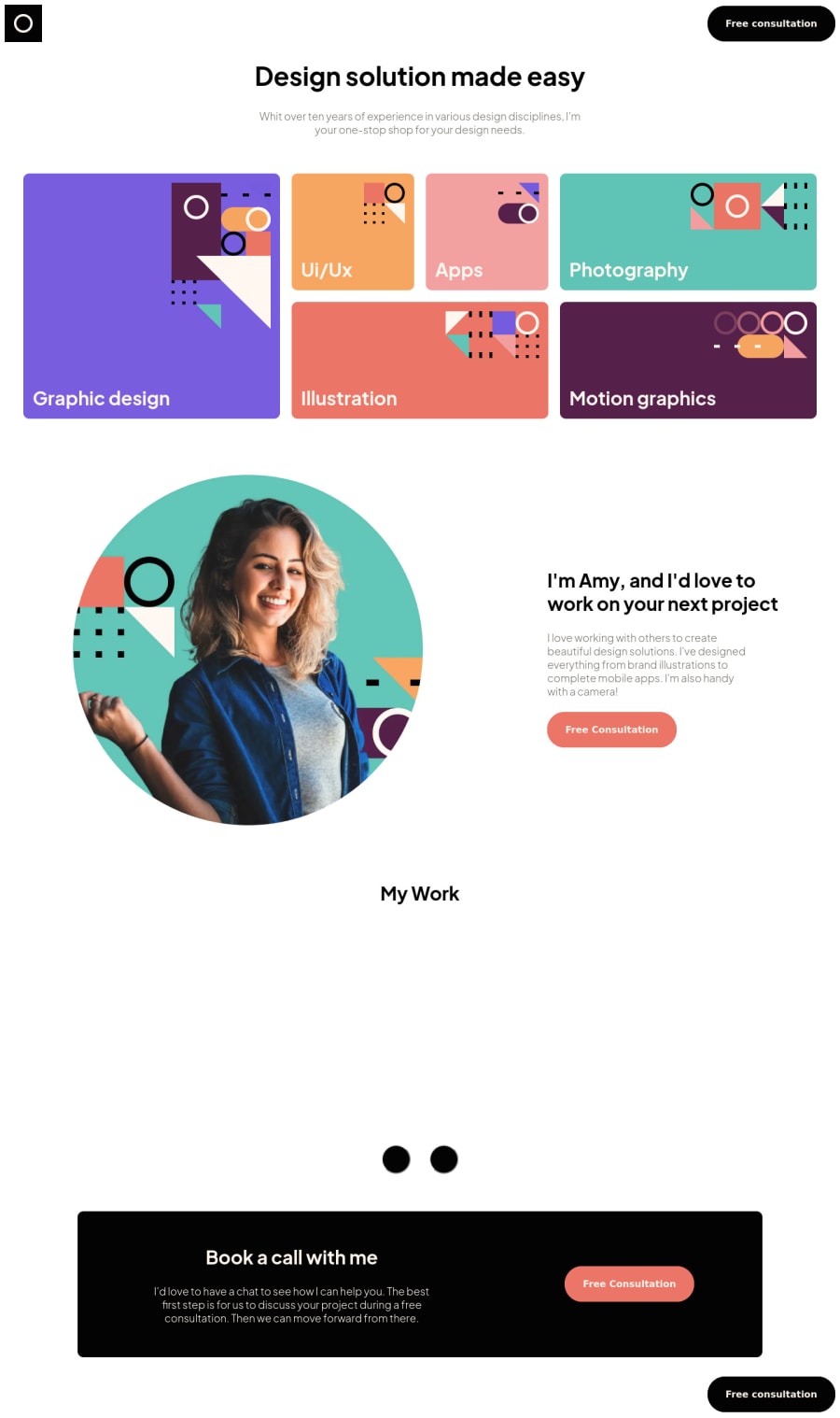
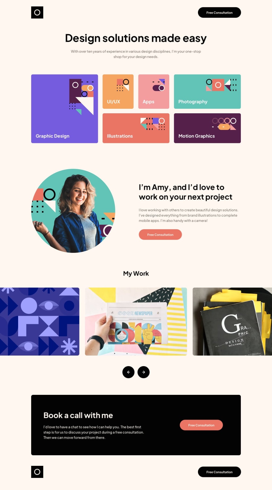
I had so much fun with this challenge, it was challenging enough but was not really so difficult that I was stuck. Still I was not able to figure out one thing, when I was working on making the gallery work with the keyboard I realized that I needed to add some styles when the buttons where in focus but once I added a style to the focus it was also styling the buttons when using the mouse. Not sure if any of you have an idea on how to solve this I would really appreciate if anyone can point me in the right direction : )
Thank you all, and keep enjoying front-end mentor : )
Community feedback
- @crsimpson5Posted over 2 years ago
Hey Lorenzo, great job on your solution! The responsive design is well done and it looks good on any screen size.
Regarding your issue, you can use
:focus-visibleinstead of:focusto make the styles show only when navigating using a keyboard. Also, you can use theoutlineproperty instead ofborderto prevent content jumping around.Here's a CSS-Tricks article if you want to read more about focus-visible. https://css-tricks.com/almanac/selectors/f/focus-visible/
Marked as helpful0@LfrancosPosted over 2 years ago@crsimpson5 wowwwww Curtis THANK YOU SOOO MUCH! This is incredible feedback, I think the things that you are mentioning are really helpful. I'll give it a try, and if I find problems at least I will know what to look for. Thank you soo much!
1
Please log in to post a comment
Log in with GitHubJoin our Discord community
Join thousands of Frontend Mentor community members taking the challenges, sharing resources, helping each other, and chatting about all things front-end!
Join our Discord
